Mastering Social Media Carousel Ads for Performance Teams
Think of a social media carousel as a mini-lookbook or a bite-sized story embedded right in someone’s feed. It's not just a collection of images; it’s an interactive, swipeable format that gets people to stop scrolling and start exploring. For anyone on a performance marketing team, this isn't just another ad type—it's a workhorse for showing off products, telling a brand story, and even getting free creative insights from a single ad.
Let's break down what makes this format so essential. Here’s a quick overview.
Social Media Carousel at a Glance
Core Concept | Key Advantage | Primary Use Case |
|---|---|---|
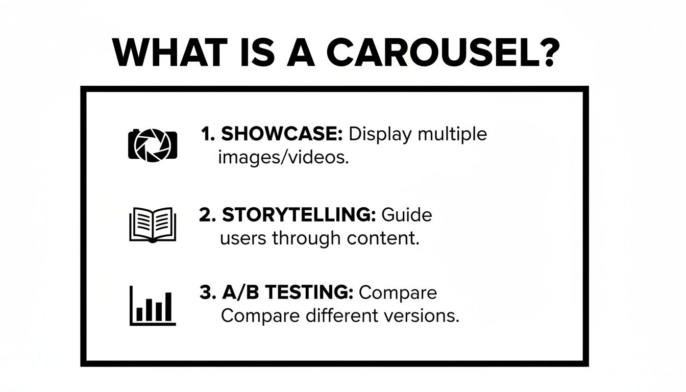
A swipeable series of up to 10 images or videos (cards) within a single ad or post. | Transforms passive scrolling into active user engagement by encouraging exploration. | Showcasing multiple products, telling a narrative story, or A/B testing creative elements. |
In short, carousels give you more real estate and more opportunities to connect with your audience in one compact unit.
The Power of the Digital Flipbook
Imagine trying to grab someone's attention with a single, static image. You get one shot. A carousel, on the other hand, is more like a digital flipbook. It invites people to interact by swiping through a series of "cards." That simple swipe is gold—it’s a conscious decision from the user, signaling to the platform's algorithm that your content is genuinely interesting.
This format completely breaks the mold of a single creative asset. It gives you a much bigger canvas to work with. You can build a narrative, walk someone through a step-by-step process, or display a whole range of products. Each card is a fresh opportunity to land a different message, highlight a new feature, or showcase another benefit, turning a flat ad into a rich, layered experience.
Why Carousels Are a Performance Marketing Staple
For teams measured on results, the real magic of a carousel goes way beyond just getting likes or comments. It’s a versatile tool that directly drives core business goals, from building awareness to ringing the cash register. The real power move is that you can give each card its own unique link, headline, and description.
Here’s exactly why performance pros rely on them:
Showcase Multiple SKUs: If you're in e-commerce, you can feature several different products in one ad, with each card linking directly to its own product page. It effectively turns your ad into a mini-catalog, dramatically increasing the odds a user finds something they actually want to buy.
Tell a Compelling Story: You can structure your cards to create a clear narrative. Card 1 might present a common problem. Card 2 introduces your product as the hero. Card 3 shows off social proof or a glowing review, and the final card seals the deal with a strong call to action. A story like this is always more persuasive than a one-off image.
Built-in Creative Testing: A single carousel is a cheap and easy A/B test. Use each card to try out a different visual hook, a new value proposition, or a unique promotional offer. When you dig into the card-level data, you’ll quickly see which messages are hitting the mark with your audience and which ones are falling flat.
A well-built carousel doesn't just show people things; it takes them on a journey. By guiding a user from one card to the next, you're not just fighting for a split-second of attention—you're holding it, building genuine curiosity, and steering them toward a specific action.
At the end of the day, carousels are a strategic weapon against creative fatigue. Instead of burning out your team producing endless new single-image ads, you can simply mix and match cards, reorder them based on what’s performing best, and refresh individual slides. This flexibility helps you find winning angles faster, optimize your ad spend, and turn passive scrollers into paying customers.
Your Technical Cheat Sheet for Carousel Ads
Every performance marketer knows the feeling: you’ve perfected your creative, written killer copy, and are ready to launch, only to be stopped dead by a platform rejection. "Image resolution too low." "Text too long." It's a massive headache.
Getting the technical specs right from the very beginning isn't just about following rules; it's about making sure your hard work actually sees the light of day. Think of these specs as the blueprint for your ad. Nail them, and you guarantee your carousel looks sharp and professional on every device.
H3: Meta Specs for Instagram and Facebook
For most advertisers, Meta is home base. While Instagram and Facebook share an ad manager, they are different beasts. Instagram is all about the visuals, while Facebook gives you a little more room for text.
The good news is their core carousel specs are aligned. You get 2 to 10 cards to play with, which is a fantastic range. You can use it for a simple product showcase or a more in-depth, step-by-step guide.
Image Format: JPG or PNG
Video Format: MP4, MOV, or GIF
Resolution: Stick to at least 1080 x 1080 pixels. This 1:1 square ratio is the gold standard.
Headline: Keep it punchy. You have about 40 characters before it gets cut off on mobile.
Primary Text: The key info should be in the first 125 characters. That’s what most people will see before having to tap "see more."
This format is incredibly flexible, letting you show off products, walk through a process, or even test different angles in a single ad.
At its core, the carousel is a mini-storytelling machine built right into your ad.
H3: LinkedIn Carousel Ad Specs
On LinkedIn, carousels feel more like a professional slide deck embedded in the feed. They're built for B2B, perfect for sharing case studies, snippets from a white paper, or key takeaways from a report.
The platform offers a unique and powerful feature: you can upload a PDF, and it will automatically convert it into a swipeable carousel. It’s a brilliant way to repurpose long-form content.
Number of Cards: 2 to 10 cards.
File Type: JPG, PNG, or a PDF.
Resolution: A 1080 x 1080 pixel square image is your best bet.
Introductory Text: The limit is 255 characters, but realistically, keep it under 150 characters to avoid getting cut off.
Card Headlines: Each card gets its own headline, with a 45-character limit.
I can't overstate how useful the PDF upload is. We’ve turned dense, 8-page reports into engaging, 8-card carousels that deliver real value in the feed. It’s a fantastic way to generate high-intent leads without forcing a click-out.
H3: TikTok and Pinterest Carousel Specs
Carousels on TikTok and Pinterest are less common but serve very specific, high-impact functions. TikTok is all about native-looking content, while Pinterest is the ultimate platform for visual discovery and inspiration.
TikTok Carousel Ads (Photo Mode): This isn't a traditional video ad. TikTok's "Photo Mode" lets you string together a series of still images that users swipe through, just like a native post. It feels incredibly organic.
Number of Images: You can use up to 35 images—way more than other platforms.
Resolution: Go vertical. A 9:16 aspect ratio (1080 x 1920 pixels) is a must for that full-screen, native look.
Ad Description: You have up to 100 characters for your caption, so make it count.
Pinterest Carousel Ads: On Pinterest, carousels are perfect for "how-to" content. Think recipes, DIY projects, or showing multiple ways to style an outfit. Each card builds on the last.
Number of Cards: A tight 2 to 5 cards.
Image Format: JPG or PNG.
Resolution: Like TikTok, vertical is king here. Aim for a 2:3 ratio (1000 x 1500 pixels).
Title: Up to 100 characters.
Description: You get a generous 500 characters, which is great for adding details and relevant keywords for search.
By keeping this cheat sheet handy, you can build your campaigns on a solid technical foundation. That frees you up to focus on what really matters: the creative strategy that will capture attention and drive conversions.
Creative Strategies for High-Performing Carousels
Alright, you've got the technical specs down. Now for the fun part—the creative strategy that actually makes a social media carousel work. A great carousel isn't just a slideshow of random images; it's a story, a mini-experience designed to pull someone from a casual scroll into a genuine conversion.
Think of it as a narrative arc. You start with a problem they can relate to, position your product as the perfect solution, show them it works, and then give them a crystal-clear reason to act. When you get this right, you transform passive swiping into an engaging little journey.

Crafting a Scroll-Stopping First Card
Your first card has one job and one job only: to stop the scroll. It’s the cover of your little digital book, and if it doesn't grab someone's attention immediately, the rest of your story might as well not exist.
Here are a few proven tactics for a killer opening:
Ask a Provocative Question: Hit them with a pain point they feel. Something like, "Tired of marketing data that makes no sense?"
Use Bold, Contrasting Colors: Design something that just doesn't look like the rest of the feed. Make it pop.
Show an Unexpected Image: A surprising or weird visual can make people stop and think, "Wait, what's going on here?"
This first impression is everything. It's the difference between a swipe left and a swipe down the feed.
Building a Seamless Visual Flow
One of the slickest creative tricks for carousels is the panoramic design. This is where you have lines, background colors, or other graphics that bleed from one card into the next, creating one long, continuous image.
This isn't just for looks—it actively encourages people to swipe. When someone sees an image that's clearly cut off, curiosity takes over. They have to swipe to see the rest. It gamifies the ad and keeps them locked into your narrative.
Imagine an arrow swooping from card two and pointing directly to a key feature on card three. That visual cue creates an irresistible pull, guiding their eyes (and their thumb) exactly where you want them. The entire ad starts to feel like a single, cohesive experience instead of ten separate pictures.
A great carousel post doesn't just display information; it creates an experience. By using connecting graphics and a logical narrative, you turn a simple ad into an interactive journey that holds user attention far longer than a static image ever could.
The proof is in the numbers. This format is exploding in popularity, now making up 14.8% of all high-engagement content. On Instagram, carousels are pulling in an average engagement of 6.90%, blowing Reels out of the water. The real shocker is LinkedIn, where carousels dominate with a massive 21.77% engagement rate, making them essential for B2B brands.
The Final Card: Your Call to Action
The last card is your closing argument. You’ve hooked them, told your story, and built trust. Now you need to tell them exactly what to do next. Don't get cute here; ambiguity is the enemy of conversion.
Your final card should be clean, direct, and focused on one single action. Use a bold headline like "Shop Now," "Learn More," or "Start Your Free Trial." A simple arrow pointing toward the CTA button is a great visual nudge to remove any last bit of friction.
By structuring your social media carousel with a strong hook, a connected story, and a clear call to action, you're building a powerful tool. It's an ad that doesn't just get seen—it gets results. For more on this, check out our guide on how to improve click-through rate.
Advanced Carousel Tactics for E-commerce and DTC
Once you’ve mastered the basics of stringing a few images together, it’s time to unlock what carousels can really do for an e-commerce or DTC brand. These aren’t just rotating pictures; they’re powerful, multi-faceted tools for driving sales, educating customers, and gathering priceless insights.
Think of each card in a carousel as its own little billboard. This gives you a unique level of control that a single image or video ad just can't offer. For performance teams, this opens up a whole playbook of advanced strategies to grab attention and boost conversions, all within a single ad placement.

Create a Dynamic Mini-Catalog
One of the most effective ways to use a carousel is to turn it into a dynamic mini-catalog. Instead of focusing on just one product, you give each card its own SKU. This is a game-changer for brands with several best-sellers or a diverse product line.
Each card gets its own spotlight: a sharp product shot, a catchy headline, and a direct link to its product page. Suddenly, your ad becomes an interactive shopping window. A customer looking for running shoes can click straight through, while someone else in the same audience might be drawn to the hiking boots on the next card. It cuts out the extra steps and speaks to multiple interests at once, dramatically increasing your odds of a conversion.
You're essentially multiplying your chances to make a sale from a single impression. It’s that simple.
Demonstrate Value with Step-by-Step Guides
Let’s be honest—sometimes, a single photo doesn't do a product justice. This is especially true for anything that needs assembly, has a bit of a learning curve, or delivers a stunning transformation. The social media carousel is tailor-made for telling that story through a step-by-step guide or a classic before-and-after.
You can structure your cards to guide the user on a short journey:
Card 1: Start with the problem or the "before" state (think: a cluttered desk).
Cards 2-4: Show your product working its magic, breaking down the process into easy steps (e.g., using your new desk organizer).
Card 5: Hit them with the grand finale—the "after" shot that shows the aspirational result (a perfectly organized, productive workspace).
This narrative approach does more than just sell; it builds trust by showing customers exactly how the product will improve their lives. You’re not just telling them it’s great; you’re proving it.
By breaking a process down into simple, swipeable steps, you educate your customer and build their confidence. This turns a product feature into a real, tangible solution they can see themselves using.
Overcome Purchase Objections Systematically
Every customer has those nagging little doubts before they click "buy." Is it easy to use? Is it worth the money? Will it even last? A carousel lets you tackle these objections head-on, with each card designed to put a specific concern to rest.
Imagine you're selling a premium blender. You could structure your carousel to dismantle buyer hesitation card by card:
Card 1: Grab their attention with a beautiful shot of the blender in a kitchen.
Card 2: Tackle 'Power': Show it crushing ice with a headline like, "Smoothies in Seconds."
Card 3: Tackle 'Hassle': Show dishwasher-safe parts with the text, "Effortless Cleanup."
Card 4: Tackle 'Durability': Mention the 5-Year Warranty to prove it's "Built to Last."
This method answers questions before they’re even asked, building a rock-solid case for your product. For more strategies on turning ad spend into predictable growth, our guide on how to scale Facebook ads is packed with actionable advice.
A/B Test Creative Elements on a Micro-Scale
Finally, one of the savviest ways to use carousels is for quick and dirty creative testing. Instead of launching multiple separate ads to test different hooks or offers, you can do it all within a single carousel.
Use the first few cards to try out different creative angles. Maybe one card has a "50% Off" banner, another pushes "Free Shipping," and a third features a user-generated photo. By digging into the card-level analytics—like swipes, clicks, and drop-off rates—you can see exactly what resonates. This gives you clear, data-backed feedback to guide your next creative sprint without burning through your budget on large, formal A/B tests.
How to Measure and Optimize Carousel Performance
Getting a social media carousel live is just the starting line. The real work—and the real opportunity—begins the moment performance data starts coming in. A carousel's power isn't just in showing multiple images; it's in the granularity of its data. You get to treat each card as its own mini-experiment.
Think of it this way: a standard image ad gives you one final grade. You either passed or failed. But a carousel gives you a full report card, with a separate grade for each subject. This lets you see exactly which part of your message is acing the test and which is failing, turning optimization from a guessing game into a surgical procedure.
Moving Beyond Standard Metrics
Of course, you still need to watch your campaign-level metrics—Click-Through Rate (CTR), Conversion Rate (CVR), and Return on Ad Spend (ROAS). These are your north stars. But for a carousel, they only tell you if the ad worked, not why. To get to the "why," you have to dig into the card-level data that platforms like Meta provide.
This is where you find the actionable insights. You can see how each individual card is performing based on metrics unique to the format.
Card-Level Clicks: Which specific image, product, or headline actually drove someone to your site?
Swipe-Through Rate: Are people engaged enough to keep swiping? This tells you if your story is holding their attention.
Drop-Off Points: Where are you losing them? This pinpoints the exact card that makes users bail.
By dissecting performance at this level, you can identify your strongest hooks and your weakest links with incredible precision.
Turning Granular Data into Action
Once you have this card-by-card breakdown, you can start making smart, strategic adjustments. This is the iterative loop where top-tier performance marketers live, constantly refining their approach to squeeze more value from every dollar spent.
The most successful performance marketers don't just launch carousels; they dissect them. They know that a single bad card can tank the entire ad's performance, while one winning card can provide the creative blueprint for the next month.
Here are a few concrete ways to put this data to work:
Reorder Your Cards: Is Card 3 getting all the clicks? Put it first. It’s that simple. Platforms like Meta even have an automatic optimization feature that does this for you, shuffling the best-performing cards to the front to instantly lift your overall CTR.
Replace Underperforming Visuals: If Card 4 has a terrible swipe-through rate and is a major drop-off point, it isn't pulling its weight. Swap it out. Test a new image, a different product angle, or a bolder callout. This is far more efficient than trashing the whole ad.
Refine Your Messaging: Are cards that feature user-generated content outperforming your polished product shots? That's a huge insight. Double down on what resonates, not just in this ad but across all your future campaigns.
Monitoring and Combating Creative Fatigue
One of the biggest headaches in paid social is creative fatigue—that inevitable point when your audience has seen your ad too many times and it just stops working. Carousels give you a powerful tool to fight this. Instead of the entire ad burning out, you might find that only one or two cards are going stale.
By keeping an eye on card-level performance over time, you can spot the early signs of fatigue on a micro-scale. When a specific card’s CTR starts to dip, you can surgically swap it out with a fresh visual or a new offer. This breathes new life into your ad without disrupting the parts that are still performing well, helping you keep your campaigns effective for much longer.
This level of detailed analysis helps you make faster, smarter decisions. It also creates a powerful feedback loop with your backend tracking. For example, understanding which carousel cards drive the most intent helps you better interpret the data coming from tools like the Meta Conversions API, giving you a much clearer picture of the entire customer journey.
Real-World Examples of Winning Carousel Ads
You can talk about best practices all day, but nothing beats seeing a great carousel ad in the wild. Let's break down a few winning examples to see how top brands use this format to hit their goals. This is where theory gets real.

By looking at the narrative flow and creative decisions behind these ads, you'll get a clearer picture of how each card can work together to drive a single, focused objective.
Example 1: The Product Showcase
One of the most straightforward—and effective—ways to use a carousel is to build a mini-catalog right in the feed. Think of a direct-to-consumer furniture brand using all ten cards on an Instagram carousel to show off its best-selling chairs. The setup is simple but incredibly powerful.
Card 1: Start with a hook. A beautiful lifestyle photo showing several chairs in a well-styled room, paired with a headline like, "Find Your Perfect Seat."
Cards 2-9: Each card is dedicated to a single product. It shows the chair on a clean background, clearly lists its name and price, and—this is key—links directly to its own product page to slash purchase friction.
Card 10: The final card is your CTA. A simple brand logo with text like, "Shop the Full Collection," linking out to the main category page.
This strategy works because it appeals to different tastes within a single ad unit, dramatically increasing the odds of getting a click. It’s a clean line from discovery to conversion.
Example 2: The Step-by-Step Guide
Carousels are also brilliant for showing, not just telling. Imagine a skincare company launching a new multi-step routine. A static image can't really do the job, but a carousel can walk a potential customer through the entire process, card by card.
This narrative approach transforms a product into a solution. By guiding the user through a process, you're not just selling features; you're building the user's confidence and showing them exactly how to achieve their desired outcome.
You see this a lot with the "faceless" content trend, where brands use carousels for quick tips, checklists, or how-to guides. It's a fantastic way to provide clear, repeatable value that builds an engaged audience without ever putting a person on camera.
Example 3: The B2B Teaser
Don't think this format is just for e-commerce. On LinkedIn, carousels are absolute gold. A recent Buffer analysis found LinkedIn carousels hit a median engagement rate of 21.77%. That completely smokes videos (7.35%) and single images (6.52%). The format’s knack for breaking down dense information into swipeable slides makes it a go-to for B2B. You can dive deeper into Buffer's analysis of social media engagement across platforms.
For example, a SaaS company could easily repurpose a white paper into an eight-card carousel. Each card teases a key statistic or an interesting insight from the report. The last card? A strong call to action like "Download the Full Report," which works as a powerful lead magnet for high-intent prospects right in their feed.
Frequently Asked Questions About Carousel Ads
When you get deep in the weeds with carousel ads, a few practical questions always come up. Nailing these details is often what separates a campaign that falls flat from one that smashes its goals. Let's walk through some of the most common sticking points.
First up: Should you let the platform automatically reorder your cards? For any direct response campaign aiming for sales or leads, the answer is almost always yes. Platforms like Meta use real-time data to push your most compelling cards to the front. Think of it as a free, built-in optimization that helps boost your ad's overall click-through rate.
Should I Use Images or Videos?
That brings us to another big question: the classic images vs. videos debate. There's no single right answer here—it all comes down to what you're trying to achieve with each card.
Images: These are fantastic for creating a "window shopping" or mini-catalog experience. If you want to show off multiple SKUs, color variations, or different angles of a product, static images get the job done quickly and clearly.
Videos: A video card is your go-to for telling a story or showing a product in action. That "how-it-works" moment or a quick user-generated clip can be the perfect pattern-interrupt to stop someone from scrolling past.
Honestly, the most powerful carousels often use a mix of both. You can lead with an eye-catching video and follow it up with crisp, static product shots.
The "magic number" of cards is a total myth. A product showcase might genuinely need all 10 cards to be effective, while a simple "how-to" guide could tell a complete story in just 3-5. The real key is making sure every single card adds value and pulls the user to the next one. Stop when the story is told.
At the end of the day, you have to test. Run different combinations of content and card counts to find out what truly clicks with your audience.
Instead of guessing which part of your carousel works, let SpendOwlAI tell you. Our system analyzes your ad performance to deliver clear, actionable insights on what to change and what to leave alone, helping you optimize creatives and reduce wasted spend. Start your free 7-day trial and see the difference today.