Master Shopping Cart Abandonment: Boost Your 2026 Ecommerce Revenue
Shopping cart abandonment is the quiet killer of so many DTC brands. You get a customer all the way to the finish line, they add a product to their cart, and then… poof. They vanish. We're talking about roughly seven out of every ten shoppers who do this. This isn't just some abstract metric; it's a gaping hole in your sales funnel that's actively bleeding out your ad spend and putting a ceiling on your growth.
Why Shopping Cart Abandonment Is Costing You Sales

Let’s be clear: every abandoned cart is a story of a customer who was ready to buy. They showed incredible intent. They browsed your site, found something they wanted, and made the commitment to add it to their cart. Then something, somewhere in your process, broke their trust or their patience.
This is where your marketing efforts face the final boss. It doesn't matter how brilliant your ad campaigns are if the checkout experience itself is frustrating or broken.
The Staggering Financial Impact
The scale of this problem is hard to wrap your head around. Across the globe, a staggering 70.22% of online shopping carts are abandoned, a number that’s held surprisingly steady for almost two decades based on an analysis of 50 different studies. If you want to dive deeper, you can explore the full cart abandonment statistics research that breaks it all down.
That percentage translates into an absolutely massive amount of lost revenue—ecommerce brands are leaving an estimated $18 billion on the table every single year from these ghost carts.
But here's the part that should really get your attention:
In the US and EU alone, a massive $260 billion in potential sales could be recovered through smarter checkout designs and frictionless experiences. This isn't just about plugging a leak; it's about unlocking a hidden revenue stream that's already in your pipeline.
Suddenly, cart abandonment goes from being a frustrating KPI to your single biggest opportunity for revenue recovery.
The Connection Between Ad Spend and On-Site Friction
A common mistake I see is brands trying to solve this problem by just spending more. They pump more budget into their Meta or Google Ads campaigns, hoping to jam enough new customers into the top of the funnel to make up for the ones falling out at the bottom. That’s a losing game. It’s like trying to fill a bucket with a massive hole in it by just turning the faucet up higher.
Every dollar you spend acquiring a customer is completely wasted if they bounce because of preventable on-site friction. Before you spend another dime on ads, it's worth checking if you have one of these classic conversion killers.
To help you diagnose the problem quickly, here’s a look at the most common reasons shoppers leave.
Top Reasons Customers Abandon Carts in 2026
This table summarizes the main drivers of cart abandonment. Use it as a quick checklist to see which of these might be hurting your conversions right now.
Reason for Abandonment | Percentage of Shoppers Affected | Primary Solution Area |
|---|---|---|
Unexpected Extra Costs (shipping, taxes, fees) | 48% | Pricing & Shipping Transparency |
Forced Account Creation | 24% | Checkout UX & Guest Checkout |
Slow Delivery Times | 22% | Shipping & Fulfillment Ops |
Complex or Long Checkout Process | 18% | Checkout UX & Form Optimization |
Couldn't See Total Cost Upfront | 17% | Pricing & Shipping Transparency |
Didn't Trust Site with Credit Card Info | 16% | Trust Signals & Security |
Website Had Errors or Crashed | 14% | Technical Performance & QA |
Unsatisfactory Return Policy | 11% | Trust Signals & Store Policies |
As you can see, the top offenders are almost always related to last-minute surprises or unnecessary friction. These aren't just lost sales; they represent a breakdown in the customer journey and a missed chance to build a lasting relationship.
Fixing your shopping cart abandonment rate is one of the highest-leverage things you can do for your business. It directly boosts the ROI of every single marketing dollar you spend.
Finding Where Your Customers Are Dropping Off

Before you can fix the leaks in your checkout, you have to know exactly where they are. Guesswork is a waste of time. To really move the needle on cart abandonment, you have to get granular and find the exact moments where your customers are hitting a wall and bailing.
Your first stop is always the quantitative data. Fire up your analytics platform—I'm assuming you're using something like Google Analytics 4 (GA4). This is where you’ll build a funnel exploration report to map the customer journey from the moment they add an item to their cart to the final "thank you" page.
Start with the Data: Build Your Funnel
Setting up this report is non-negotiable. It’s the only way to see the drop-off rate between each and every step. For most ecommerce stores, the funnel stages you'll want to track are pretty standard:
Add to Cart: The starting line.
Begin Checkout: They've committed to starting the process.
Add Shipping Information: The first major form.
Add Payment Information: The moment of truth.
Purchase Complete: The finish line.
Once this is configured, you'll immediately see where the biggest leak is. You might find that a whopping 30% of users who start the checkout process never make it past the shipping page. That’s not just a data point; it's a giant, flashing sign telling you that something is seriously wrong with your shipping options, costs, or even just the form itself.
This is how you go from a vague "our sales are down" problem to a specific, solvable one: "we need to fix the shipping page."
Get the "Why" with Session Recordings
Okay, so the numbers tell you what is happening. Now you need to find out why. This is where qualitative tools like Hotjar or Fullstory become your best friends. These tools let you watch anonymized screen recordings of what real people are doing on your site.
It's like having the ability to look over your customer's shoulder as they shop. You see every confused mouse movement, every frustrated click, every moment of hesitation. It’s context that raw numbers can never give you.
Let's go back to that GA4 report. Say it shows a huge drop-off on the payment page. You watch a few session recordings of users who abandoned there, and you see three of them rage-clicking a grayed-out "Apply Discount" button that simply doesn't work. Bingo. You've just found undeniable proof of a bug that is actively killing your sales.
By layering analytics with session recordings, you get the full story—both the "what" and the "why."
A Practical Checklist for Your UX Audit
Armed with data on where and why people are leaving, it’s time to walk a mile in their shoes. Go through your own checkout, but do it with a critical eye, focusing on the friction points you've already identified.
Key Audit Questions to Ask Yourself:
Mobile vs. Desktop Experience: How does it feel on a phone? Are the buttons big enough for a thumb? Does the layout break, forcing people to pinch and zoom just to fill out a form? Mobile abandonment is almost always higher, so you need to be ruthless here.
Page Load Speed: How long does each step actually take to load? Use a tool like Google PageSpeed Insights to get an objective measure. A three-second delay is an eternity when a customer has their credit card in hand.
Form Field Friction: Are you demanding their life story? Forcing users to create an account is a classic conversion killer—24% of shoppers say they’ve abandoned a purchase for this very reason. Always, always offer a prominent guest checkout.
Clarity and Trust: Are shipping costs and taxes a surprise at the very end? That’s a guaranteed way to lose a sale. You also need to make sure trust signals—like security badges and accepted payment logos—are front and center to reassure nervous buyers.
Run this audit on both your desktop and mobile sites. You’ll almost certainly find that what works great on a big screen is a complete disaster on a phone. By methodically diagnosing these issues, you'll have a clear, prioritized action plan for tackling cart abandonment where it starts.
Alright, let's move from diagnosis to action. You've mapped your funnel and have a good idea of why shoppers are bouncing. Now it's time to roll up our sleeves and implement the fixes that will make the biggest difference, starting with the most notorious conversion killer of them all.
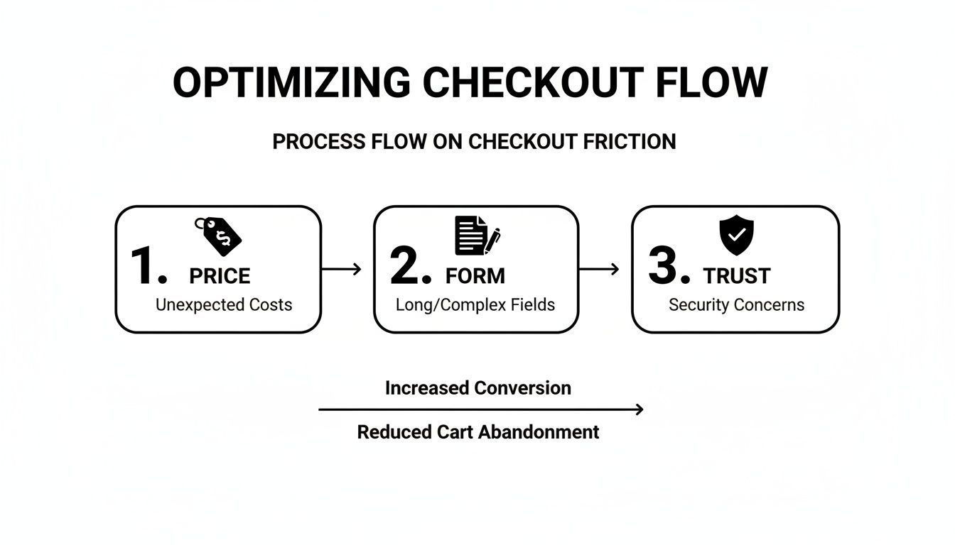
Tackle the #1 Conversion Killer: Surprise Costs
There is no faster way to kill a sale than to spring an unexpected fee on a customer at the last second. They've already mentally committed to a price, so any surprise shipping cost, tax, or handling fee feels like a bait-and-switch.
This isn't just a minor annoyance; it's the main reason people leave. Extra costs blindside 48% of shoppers, sending them straight for the exit button and making it the top reason for abandonment in virtually every study. This single issue is a massive contributor to the 70.22% global average abandonment rate. For retailers in the US and EU, this friction point is responsible for an estimated $260 billion in lost sales—money that's recoverable with UX tweaks that have been shown to lift conversions by as much as 35.26%. To see how this breaks down by industry, you can read more about these ecommerce cart abandonment findings.
The solution isn't always about offering free shipping (though it's a powerful incentive). The real fix is radical price transparency from the moment a customer shows interest.
Your goal should be to ensure the final price is never a surprise. If a customer is shocked at the total cost on the payment page, you’ve failed to build trust earlier in the journey.
Here’s how to put price transparency into practice:
Add a Shipping Calculator to the Cart: Don't make them wait until the final step. Let users pop in a zip code right from the cart page or a slide-out drawer to see their shipping costs upfront.
Show Estimates on Product Pages: If you have standardized shipping rates, display them directly on the product detail page. A simple line like "Ships for $5.99" or "Free shipping on orders over $75" sets expectations immediately.
Use Geo-IP for Early Estimates: You can use a customer’s IP address to automatically detect their country and provide a more accurate shipping and tax estimate much earlier in the process.
Streamline Your Forms to Fight Checkout Fatigue
Right behind surprise costs is the second biggest hurdle: a long, complicated checkout process. Every single field you ask a customer to fill out is another chance for them to lose momentum and walk away. Your job is to make this feel less like paperwork and more like a simple, guided step.
The most common offender here is forcing users to create an account. Yes, building a customer list is important, but holding a purchase hostage to do it is a guaranteed way to lose sales. A staggering 24% of shoppers admit to abandoning a purchase specifically because a site required them to create an account.
The fix is simple: lead with a big, bold guest checkout option. This tells the customer you respect their time and their primary goal, which is to buy your product. You can always prompt them to create an account on the "thank you" page after the sale is complete, when the pressure is off.
Simple Strategies to Reduce Form Friction
Go through your checkout flow field by field and ask yourself one ruthless question: "Is this information absolutely essential to fulfill this order?"
Here are a few key optimizations that have a huge impact:
Address Autofill: Integrating a tool like Google Places Autocomplete is a game-changer. As a user starts typing their address, verified options appear. This saves keystrokes and, just as importantly, prevents costly shipping errors from typos.
Single Name Field: Ditch the separate "First Name" and "Last Name" fields. A single "Full Name" field is one less tap or click for the user and feels more natural.
Smart Defaults: Use a checkbox for "Billing address is the same as shipping" and make sure it's checked by default. This instantly hides a whole block of redundant fields for the vast majority of your customers.
Mobile-Friendly Keypads: On mobile, make sure the numeric keypad automatically appears for fields like phone number, zip code, and credit card number. It's a small detail that removes a surprising amount of friction.
These small tweaks compound to create a much smoother, faster journey that keeps the customer’s focus on completing their purchase. To see how these ideas fit into a larger plan, take a look at our complete guide on website conversion optimization.
Build Unshakeable Trust at the Final Hurdle
The moment a customer pulls out their credit card, their "scam detector" is cranked to the max. You need to do everything possible to reassure them that their information is secure and their purchase is protected. We call these trust signals.
It’s not enough to be a trustworthy business; you have to look like one. This means placing visual cues strategically throughout the checkout, especially right next to the fields where they're entering sensitive data.
Where to Place Your Most Important Trust Signals:
Trust Signal | Best Placement | Why It Works |
|---|---|---|
Security Badges (e.g., McAfee, Norton) | Directly beside the "Place Order" button and credit card fields. | Reassures users at the exact moment of payment that the transaction is secure. |
Payment Logos (Visa, Mastercard, PayPal) | Clearly visible as soon as the payment section loads. | Confirms you accept their preferred payment method, removing any doubt. |
Clear Return Policy | A short, linked summary ("Easy 30-Day Returns") in the cart or checkout footer. | Eases the fear of making a mistake by showing they have an out if the product isn't right. |
By being transparent with costs, simplifying your forms, and proudly displaying trust, you dismantle the three biggest psychological barriers to a sale. This is how you turn a leaky checkout into a conversion machine.
Building Your Automated Cart Recovery System
Even with a perfectly tuned checkout process, people are going to leave. Life happens. A kid starts crying, the boss calls, or they just get cold feet. But a lost cart doesn't have to be a lost sale. This is where your automated cart recovery system comes in—it’s your 24/7 safety net.
Think about it: someone who adds a product to their cart is about as warm a lead as you can get. They’ve already done the hard work of discovering your brand and finding something they want. All you need to do is give them a timely, relevant nudge to finish what they started.
The most successful brands I’ve worked with use a combination of email and SMS. It’s not about blasting them on every channel, but about reaching them in the right place, at the right time, with the right message.
The Anatomy of a High-Converting Email Sequence
Let’s be honest, a single "You left something behind!" email just doesn't cut it anymore. We've all seen them, and we've all ignored them. To actually get someone’s attention, you need a strategic sequence—a multi-step flow that builds on itself over a couple of days. My go-to strategy is a three-part series sent over a 48-hour window.
The goal is to gently overcome the most common friction points—price anxiety, form fatigue, and trust issues—that cause people to leave in the first place.
Your recovery emails are a second chance to address these hesitations head-on, reminding them why they were interested and making it incredibly easy to complete the purchase.
From what I've seen across countless campaigns, sending a sequence of two or three recovery emails is dramatically more effective than just one. It’s not unusual for these sequences to hit an open rate of over 40%. The trick is to make each email feel different, not just a carbon copy of the last.
Here's a battle-tested sequence you can steal and adapt for your own brand. If you're new to setting up automated flows like this, our guide on the drip campaign definition is a great place to start.
Here is a practical template you can adapt for your email platform, outlining the timing, subject line, and content for each recovery email.
A Proven 3-Step Abandoned Cart Email Sequence
Timing | Subject Line Strategy | Core Message | |
|---|---|---|---|
1. The Reminder | 1 Hour Post-Abandon | Simple & Helpful: "Did you forget something?" | A low-pressure check-in. The goal is to simply remind them and provide an easy link back to their cart. Include product images. |
2. The Value-Add | 24 Hours Post-Abandon | Build Confidence: "Still thinking it over?" | Overcome hesitation. Share a top customer review for an abandoned item (social proof) or link to your shipping/returns FAQ. |
3. The Final Nudge | 48 Hours Post-Abandon | Create Urgency: "Your cart is about to expire." | Your last attempt. Hint at low stock or, if your strategy allows, offer a small, one-time incentive like free shipping or 10% off. |
This structure works because it escalates the conversation naturally without being pushy. You start with a gentle reminder, move to building trust, and end with a clear reason to act now.
Adding SMS for Immediate Impact
SMS has become a secret weapon for recovering shopping cart abandonment because people actually open their texts—the open rates are close to perfect. But with great power comes great responsibility.
Texting is personal, so your tone needs to reflect that. It should be short, friendly, and feel like a one-on-one conversation. Most importantly, you must have explicit consent to send marketing texts to stay compliant.
A simple, effective SMS might go out 30-60 minutes after the cart is abandoned. Something like: "Hey [Name], it's [Your Name] from [Brand]. Saw you left a few things in your cart. Here’s the link if you want to pick up where you left off: [Link]." That's it. No hard sell, just a helpful reminder.
Retargeting Ads as Your Final Safety Net
So what happens if you don't have an email or phone number? Or what if they just ignore your messages? This is where dynamic retargeting ads on platforms like Meta and Google Ads become your ace in the hole.
I'm not talking about generic brand awareness ads. I mean dynamic product ads that show the exact items someone left in their cart. These ads follow them around the web, popping up in their social feeds or on other sites they visit, acting as a constant visual cue.
Set up a dedicated campaign that targets users who triggered an "Add to Cart" event but not a "Purchase" event within the last 7-14 days. It’s an incredibly efficient way to recapture sales that would have otherwise vanished for good.
How to Measure and Continuously Improve Your Results

Getting your initial fixes and recovery automations live is a huge step, but it’s really just the beginning. The real, lasting wins in the fight against shopping cart abandonment come from building a system of continuous improvement.
This is where you shift from one-off projects to a steady rhythm of testing and learning. It’s the difference between getting lucky with a few tweaks and building a truly optimized machine that consistently turns more browsers into buyers.
Know Your Numbers: What to Track
Before you change anything else, you need to know what success looks like. Your most important metric, your North Star, is your overall Cart Abandonment Rate.
The formula is simple: 1 - (Completed Transactions / Carts Created) = Cart Abandonment Rate
But looking at this number alone can be deceiving. A lower rate is good, but you need the full story. That’s why you have to track a few other key performance indicators (KPIs) alongside it.
Checkout Completion Rate: Of all the people who start the checkout process, what percentage actually finish? This is the single best measure of your checkout’s health.
Revenue Recovered: This is the hard dollar amount your abandoned cart emails, SMS messages, and retargeting ads are bringing back. It's the ultimate proof that your recovery efforts are delivering ROI.
Time to Purchase: How long does it take from the moment someone adds an item to their cart to when they click "complete order"? Shorter times usually point to a smoother, more intuitive experience.
When you look at these metrics together, you get a much clearer picture. Seeing your cart abandonment rate drop is great, but knowing it happened alongside a 20% jump in checkout completion and $5,000 in recovered revenue tells you exactly what’s working and why.
A Smart Framework for A/B Testing
With your core metrics in place, it’s time to start experimenting. A/B testing (or split testing) is how you move from "I think this will work" to "I know this works." It’s all about pitting two versions of an element against each other to see which one gets better results.
Don’t just test random things. Every test should start with a hypothesis grounded in the data you’ve already gathered.
For instance, if your analytics show a huge drop-off on the payment page for mobile users, your hypothesis might be: "By adding Apple Pay as a payment option, we can increase our mobile checkout completion rate by 5% because it removes the friction of manually entering card details."
High-Impact Areas to Start A/B Testing:
Checkout Flow: Is your multi-step process a killer? Test it against a single-page checkout.
Trust Signals: Do security badges work better right below the "Place Order" button or in the site footer? Test it.
Form Fields: Try removing an optional field like "Company Name" and measure the impact on your completion rate. I’ve seen this alone lift conversions.
CTA Wording: Is "Complete Purchase" more compelling than "Buy Now"? The only way to know for sure is to test it.
You should also be testing elements within your recovery emails and SMS flows, from subject lines to different offers. When you run tests across different campaigns, it's essential to have clean tracking. Our guide on using UTM parameters for Google Analytics is a great resource for this.
Keep a Record and Build on Your Wins
An experiment is only useful if you learn from it. That’s why every team I’ve worked with keeps a simple experiment log, usually just in a spreadsheet. This becomes your playbook.
For every test, make sure you document:
Hypothesis: What you predicted would happen.
Change: A quick description of what you tested (the "B" version).
Metrics: The primary KPI you were trying to move (e.g., checkout completion rate).
Results: The raw data and whether the outcome was statistically significant.
Learnings: The takeaway. What did you learn about your customers?
Over time, this log becomes your company’s institutional knowledge. It prevents you from re-running failed tests and ensures every new change you make is built on the foundation of what you’ve already proven to work.
Your Top Cart Abandonment Questions, Answered
Once you start digging into your own cart abandonment data, the same questions tend to bubble up. It's one thing to understand the theory, but applying it to your specific store, with your unique customers, is where the real work begins.
Let's clear up some of the most common sticking points I see teams run into. Here’s some straightforward advice to help you navigate them.
What’s a Good Cart Abandonment Rate to Aim For?
I get this question all the time. While you'll hear the industry average is a staggering 70%, a truly "good" rate is simply one that’s better than what you have right now. Getting bogged down by industry-wide stats is a great way to get discouraged.
Instead, focus on beating your own numbers. If you're sitting at 75% abandonment, setting a goal to hit 70% in the next quarter is both realistic and incredibly impactful for your bottom line. Sure, some elite brands can dip below 30%, but that’s the result of years of relentless optimization. Track your own progress month-over-month and celebrate your own wins.
Why Is My Abandonment Rate So Much Higher on Mobile?
You're not imagining it. Mobile cart abandonment is almost always higher than on desktop, often by 10-15% or even more. Think about the context: people are shopping on smaller screens, often with spotty connections, and are bombarded with notifications and other real-world distractions.
Your checkout has to be built for thumbs, not just be "mobile-responsive." We're talking big, tappable buttons, as few form fields as humanly possible, and seamless mobile payment options.
This is where digital wallets like Apple Pay or Shop Pay become a necessity, not a nice-to-have. They let a shopper completely bypass the nightmare of fat-fingering their shipping address and credit card number on a tiny keyboard. It’s the single biggest improvement you can make to your mobile checkout.
My best advice? Filter your session recording tools to watch only mobile users. Seeing someone struggle to tap a tiny link or pinch-and-zoom to fill out a form will show you exactly why they're giving up.
Do Abandoned Cart Emails Actually Still Work?
Yes, they absolutely do—but only if you put some thought into them. The days of a single, generic "You left something in your cart!" email recovering sales are long gone. Shoppers are smart and have developed a sixth sense for lazy marketing.
A well-timed, multi-email sequence, however, can still reliably claw back 10-15% of what would have been lost revenue. The trick is to add value with each touchpoint, not just repeat the same message. A solid flow usually looks something like this:
Email 1 (after 1 hour): Start with a friendly, low-pressure reminder. Show them clear images of what they left behind and give them a single, obvious link to get right back to their cart.
Email 2 (after 24 hours): Now, anticipate their hesitation. Add some social proof by including a top customer review, or directly address trust concerns by linking to your easy returns policy.
Email 3 (after 48 hours): If they still haven't bought, it's time for a final nudge. You can create a little polite urgency or offer a small, compelling incentive like free shipping to close the deal.
Your goal is to be a helpful shopping assistant, not a nagging salesperson.
Should I Force Customers to Create an Account Before Checkout?
Never. This is a classic conversion killer and consistently ranks as one of the top reasons for cart abandonment. In fact, studies show 24% of shoppers have ditched a purchase simply because they were forced to create an account.
Always, always lead with a big, bold, beautiful guest checkout option. This respects the customer's primary goal: to buy your product with as little friction as possible. You can always offer them the chance to create an account after the sale is complete, right on the "thank you" page. Secure the transaction first, then work on building the relationship.
Ready to turn noisy ad data into clear, prioritized actions that reduce waste and boost revenue? SpendOwlAI provides a daily execution system that tells you exactly what needs your attention and what should be left alone. Start your free 7-day trial and execute with confidence. Learn more at SpendOwlAI.