Master the Instagram Carousel Post to Boost Engagement
An Instagram carousel is a single post that lets you string together up to 10 photos or videos for your audience to swipe through. For marketers, this format isn't just a feature—it's become a serious strategic advantage. Why? Because it keeps users glued to your content longer, which is a massive signal to the Instagram algorithm that you're posting high-value stuff.
Why the Carousel Post Is an Engagement Powerhouse
Ever feel like your single-image posts are just getting lost in the noise? You're not imagining it. The Instagram algorithm has evolved to favor content that holds attention, and the carousel format is built for exactly that. A static image gets a quick glance, but a carousel invites users to actively swipe, turning a passive scroll into a mini-experience.
Every single swipe is a micro-commitment. It tells the algorithm that your content is interesting enough to interact with. This is why Instagram often gives carousels a "second chance" in the feed. If a follower scrolls past without engaging the first time, Instagram might show them the post again, but leading with the second slide. It's a unique built-in feature that essentially doubles your shot at grabbing their attention.

Driving Deeper Connections and High-Value Actions
Carousels go way beyond simple likes. They're incredible for driving actions that signal real interest, like saves and shares. When you pack value across multiple slides—think a quick tutorial, a behind-the-scenes look at a product, or a compelling story—people are far more likely to save it for later. For any e-commerce brand, this is gold for staying top-of-mind.
This format is also the perfect antidote to creative fatigue. Instead of hunting for that one "perfect" shot, you can tell a more complete story. You can break down a complex topic, show off a product from every angle, or walk your audience through a problem and present your product as the solution. It transforms a simple post into a genuinely useful piece of content.
The Data Behind Carousel Dominance
The performance boost isn't just a hunch; the numbers don't lie. Let's look at how carousels stack up against other popular formats.
Carousel Posts vs Other Formats at a Glance
Metric | Instagram Carousel Post | Single Image Post | Reels Video |
|---|---|---|---|
Average Engagement Rate | ~10% | ~7% | ~6% |
Business Acct. Engagement (vs. Reach) | 3.55% (Highest) | Lower | Lower |
Best For | Storytelling, Education, Product Showcases | Quick Updates, High-Impact Visuals | Entertainment, Virality, Brand Awareness |
As you can see, carousels consistently outperform other formats, especially for business accounts trying to maximize their return on content. For a deeper dive into these trends, Ned-Potter.com has some great analysis.
The data makes it pretty clear that carousels are a critical tool for anyone serious about getting results on Instagram.
The takeaway is clear: Mastering the carousel isn't just about posting multiple pictures. It's about strategically sequencing content to maximize dwell time, encourage interaction, and ultimately drive meaningful business results.
This ability to guide a user's journey slide-by-slide makes carousels essential for paid social campaigns. You can build curiosity, handle objections, and lead them straight to a strong call-to-action on that final slide. Done right, it’s a direct path to a better click-through rate. If you're looking for more ideas on that front, we've got a whole guide on how to improve click-through rate.
Laying the Groundwork: Your High-Performance Carousel Blueprint
Before you even think about creative angles or compelling copy, you need to get your foundation right. I'm talking about the technical nuts and bolts. A high-performance Instagram carousel starts with a solid blueprint, and getting the specs right is non-negotiable. This isn’t just about avoiding blurry images; it’s about creating a seamless user experience that the algorithm rewards from the second you post.
Think of this as your pre-flight checklist for any carousel, whether it's for an organic post or a paid social campaign. Nailing these details ensures your creative has the best possible chance to stop the scroll and keep people swiping. Trust me, even the most brilliant concept will fall flat if the technical execution is sloppy.

Mastering the Technical Specs
When it comes to carousel dimensions, you've got two main choices: the classic 1:1 square or the more dominant 4:5 portrait. In almost every case, especially for e-commerce and marketing, you want to go with the 4:5 portrait (1080x1350 pixels). Why? It simply takes up more screen real estate, pushing competitors out of view and making your visuals feel much more immersive.
The golden rule here is consistency. You can technically mix aspect ratios in one carousel, but don't. It creates a clunky, unprofessional experience as the frame jumps around with each swipe. Pick one dimension and stick to it for every single slide.
Here are the core specs I always lock in:
Resolution: Always design at a width of 1080 pixels. This is the sweet spot for keeping everything looking sharp and professional on modern phone screens.
File Types: For static images, use PNG if you have text or sharp graphics—it keeps them crisp. For photos, a high-quality JPG is your best bet.
Video Format: If you're dropping in video clips, make sure they're in MP4 format. It's the most reliable for compatibility and smooth playback on the platform.
How Many Slides Should You Actually Use?
The number of slides in your carousel needs to be a strategic decision, not just a random number. In early 2024, Instagram actually doubled the slide limit from 10 to a whopping 20, which opens up a ton of room for deeper storytelling. But just because you can use 20 slides doesn't mean you should.
More slides don't automatically equal more engagement. From what I’ve seen work best, the sweet spot for most educational or brand-focused carousels is somewhere between 8-12 slides. This gives you enough space to tell a full story without risking user drop-off. If you're interested in the data behind this, StackInfluence has a great breakdown of carousel performance trends.
Your slide count should serve your story, not the other way around. A quick "Before & After" might only need three slides to make its point. A detailed product tutorial could easily use all twelve. Every single frame has to earn its spot.
This is where planning makes all the difference. For an e-commerce brand, a 15-slide deep dive showing off a product’s features, materials, and real-world use cases could be incredibly effective. On the other hand, a quick "3 Tips" post is better served in a punchy 5-slide format that delivers value fast and gets people to hit "Save."
The Untapped Power of Mixed Media
Here's a pro-tip that so many brands overlook: mix your static images with short video clips. This is one of the easiest ways to boost your post’s performance because it significantly increases dwell time—how long someone spends looking at your content.
Think about it. When a user is swiping through static images and suddenly lands on a video that starts auto-playing, it breaks their pattern. They pause. That little hesitation is a massive positive signal to the Instagram algorithm that your content is engaging and worth showing to more people.
Here’s how you can put this into action:
E-commerce Product Tour: Start with a gorgeous hero shot of your product (Slide 1). Follow it up with a 3-second video of it in action (Slide 2). Then, use the remaining static slides to zoom in on specific features and benefits.
Educational "How-To": Use static slides with bold text to outline the steps. When you get to a tricky part, insert a quick video clip demonstrating that specific action. It makes the whole process much easier to follow.
By weaving different media types together, you’re not just sharing information; you’re creating a more dynamic and memorable experience. This blueprint isn't about following rigid rules—it's about making smart, intentional choices that set your carousel up for success from the very beginning.
Crafting a Compelling Carousel Narrative
A carousel that’s technically perfect but has no soul is just a collection of pixels. The real magic, the kind that gets results, happens when you stop thinking about specs and start thinking like a storyteller. The best carousels I've ever run weren't just random images; they were carefully structured narratives that took the viewer on a journey, one swipe at a time.
Think of your first slide as a movie poster. It has one job: stop the scroll. That single frame has to be magnetic enough to make someone slam the brakes on their endless feed and commit. If that first slide fails, the rest of your incredible story goes unseen. It’s easily the most critical part of the entire post.

Proven Narrative Frameworks for Carousels
You don't have to start from a blank canvas every single time. In my experience, leaning on proven storytelling frameworks is the fastest way to build a carousel that flows logically and keeps people hooked.
One of the most reliable models for e-commerce is Problem-Agitate-Solve (PAS). It's a classic for a reason—it just works.
Problem (Slides 1-2): Kick things off with a pain point that's instantly recognizable to your audience. Be specific.
Agitate (Slides 3-5): Don’t just state the problem—twist the knife a little. Show the frustration or the wasted time it causes. Make them feel it.
Solve (Slides 6-8): Here’s where you swoop in. Introduce your product as the clear, elegant solution and focus on the benefits of that solution.
Another powerhouse is the Before-and-After narrative. This is gold for any product with a visible impact, like skincare, home organization, or fitness tech. The trick is to make the "before" shot feel genuine and the "after" aspirational but still believable. The slides in the middle are perfect for breaking down how the transformation happened.
Designing a Scroll-Stopping First Slide
That first slide is your hook, and it needs to be sharp. A bland product shot just isn't going to cut it in a crowded feed. You have to spark immediate curiosity or make a clear promise of value.
Here are a few angles that consistently perform well:
A Bold Claim: "You're Wasting 50% of Your Ad Spend. Here's Why." It's a direct challenge that promises a valuable reveal.
A Relatable Problem: "That feeling when you have 10 tabs open and still can't find the right data." This hits home with your target audience's daily struggles.
A Provocative Question: "What if you could plan a campaign in 10 minutes?" This makes people lean in, wanting to know the answer.
The goal of the first slide isn't to tell the whole story. It's to make a promise that the rest of the carousel will fulfill. Keep it visually clean with big, readable text that makes an impact in a split second.
Maintaining Momentum Slide by Slide
Once they’re hooked, your job is to keep them swiping. Each slide needs to feel like a satisfying next step. If the sequence is disjointed or confusing, you'll lose them in a heartbeat.
This is where visual cues become your best friend. These are little design tricks that create a cohesive flow and practically beg the user to see what's next.
Connected Graphics: Have a line, a shape, or a background element bleed from one slide into the next. This creates a powerful visual pull that makes swiping feel like the natural next step.
Directional Cues: Don't be shy. A simple arrow or a "Swipe for more" text overlay explicitly tells people what to do. Never assume they'll keep going on their own.
Numbered Lists: Structuring your content as "5 Ways to..." or "3 Mistakes to Avoid" creates a clear sense of progression and an endpoint, motivating people to swipe all the way through.
I always think of a carousel as a mini-presentation. Each slide has to build on the one before it, adding another layer to the narrative. If you make a bold claim on slide one, the next few slides better bring the receipts with data, examples, and proof. That's how you build trust and keep your reader invested.
Finally, you reach the last slide. This isn't just a throwaway ending; it's the destination you've been guiding them toward. This is where you land your powerful, crystal-clear Call to Action (CTA) and turn all that engagement into a real business outcome.
Writing Copy That Drives Action
A visually stunning carousel can stop the scroll, but it's the copy that actually makes people do something. The words you use—both in the caption and on the slides—are what give your visuals context, deliver value, and ultimately, push your audience to take that next step.
Think of it this way: the caption hooks them from the feed, and the on-slide text keeps them swiping. If one part is weak, the whole thing falls apart. It’s a beautiful car with no engine; it looks great but isn't going anywhere.
Crafting the Perfect Caption Hook
Instagram cuts off your caption after the first two lines, giving you a tiny window to convince someone to tap "...more." That initial snippet has to be magnetic. It needs to stop their thumb mid-scroll and make them curious.
Your first couple of lines are your headline. They need to make a promise or open a curiosity gap that people feel an urge to fill.
Here’s how I’ve seen this work best:
Lead with the Core Value: Don't bury the good stuff. Start with the most impactful benefit right away. For example: "Stop wasting ad spend on the wrong metrics. Here are the three you actually need to watch."
Ask a Relatable Question: Hit on a common pain point. It creates an instant connection. Something like: "Ever feel like your creative ideas get stuck in approval limbo?"
Use Emotive or Surprising Language: A bold claim can be a powerful scroll-stopper. For instance: "This one change to our checkout process increased conversions by 17%."
The rest of your caption should then pay off that initial hook, expanding on the story and adding the details that support your carousel's main message.
Keeping On-Slide Text Brief and Punchy
When it comes to the text on the carousel slides themselves, less is truly more. People are swiping fast. They aren’t going to stop and read a paragraph. Your job is to create a clear, scannable information hierarchy.
Focus each slide on one single idea. Use big, easy-to-read fonts and high-contrast colors so the message stands out. If you have complex information, break it down into simple bullet points or a numbered list. This makes the content feel way less intimidating and much easier to digest on the fly.
The text on each slide should act as a signpost, not a novel. Its job is to guide the user to the next piece of the story, building momentum with every swipe.
Treat your on-slide copy like chapter titles building anticipation for the final slide, which is where you'll make your big ask.
Designing a Powerful Final Slide CTA
Your final slide is the destination. You've spent the entire carousel leading people here. A weak or missing Call to Action (CTA) at this point is a massive fumble. After investing their time swiping through your content, users are primed for action—you just have to tell them exactly what to do.
The CTA you choose has to align perfectly with your campaign goal.
For Driving Sales (Direct Response): Be direct. Use action-packed verbs that leave zero room for doubt. Think "Shop The Collection Now," "Tap the Link in Bio to Buy," or "Get Your Free Trial."
For Building Engagement (Community): Encourage actions that will boost your post's visibility and get a conversation started. Try prompts like "Save this post for later," "Share this with a friend who needs it," or "What are your thoughts? Let us know below!"
For Generating Leads (Top of Funnel): Offer something valuable in exchange for their attention. CTAs like "Comment 'GUIDE' to get the free checklist" or "Tap to sign up for the webinar" are incredibly effective.
A great carousel doesn't just inform; it persuades. For e-commerce brands, connecting that powerful CTA to a frictionless buying experience is everything. Take a look at our guide on website conversion optimization to make sure your landing pages are primed to convert the traffic your carousels send. That last slide is your moment to turn a viewer's interest into a real business result.
A Practical Framework for Testing and Optimization
Creating a high-performing Instagram carousel is part art, but the real magic comes from the science of testing. If you're just guessing what works, you're leaving results on the table. A simple, data-driven testing framework is your best friend here, turning creative hunches into measurable wins and showing you what actually resonates with your audience.
The key is to avoid testing everything at once. Instead, you'll want to focus on isolating one key variable at a time. This methodical approach is the difference between throwing spaghetti at the wall and building a repeatable formula for success. It gives you clean, actionable insights for your next campaign.
Isolating Key Variables to Test
To run a truly effective A/B test on your carousels, you have to be surgical. Pick a single element to change and create two versions of your post that are identical in every other way. This is the only way to know for sure that the variable you tested is what caused the shift in performance.
Here are the most impactful variables I always recommend starting with:
The First Slide Hook: This is the big one. Your first slide has one job: stop the scroll. Test a bold statistic against a relatable question, or pit a clean, text-heavy graphic against a compelling lifestyle photo.
The Final Slide CTA: The call-to-action is your money slide. Don't just default to "Shop Now." Try testing it against something softer, like "Save this for later." You might be surprised to find that a less aggressive ask drives more valuable long-term engagement.
Narrative Sequence: Storytelling matters. Does a classic "Problem-Agitate-Solve" sequence outperform a straightforward "Step-by-Step" guide for your audience? Test two different narrative flows to see which one keeps people swiping.
Slide Count: Is shorter better? Test a concise 5-slide carousel against a more in-depth 10-slide version covering the same topic. This will tell you a lot about your audience's appetite for longer-form content.
This simple diagram breaks down the fundamental copywriting flow of a carousel, from grabbing attention to driving action.
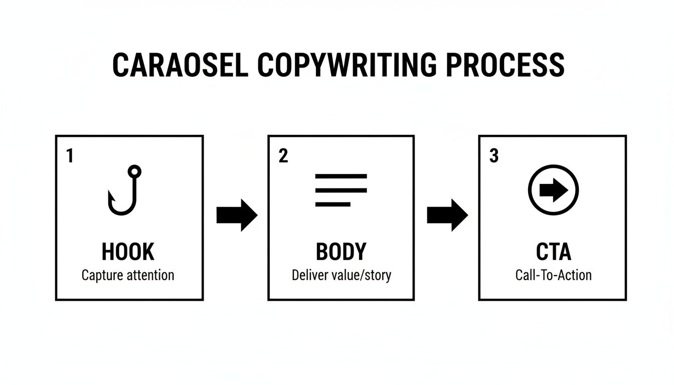
Each of these three stages—Hook, Body, and CTA—is a prime opportunity to test different approaches and optimize your results.
To keep your experiments organized, a simple framework is invaluable. It helps you define exactly what you're testing, why you're testing it, and how you'll measure success before you even hit "publish."
| A/B Testing Framework for Instagram Carousels |
| :--- | :--- | :--- | :--- |
| Element to Test | Variable A (Control) | Variable B (Test) | Primary Metric to Track |
| First Slide Hook | Lifestyle Image | Text-based Question | Swipe-Through Rate |
| Final Slide CTA | "Shop Now" (Direct) | "Save for Later" (Soft) | Saves / Website Clicks |
| Narrative Sequence | Problem-Agitate-Solve | Step-by-Step Tutorial | Average Slides Viewed |
| Slide Count | 5 Slides (Concise) | 10 Slides (In-Depth) | Completion Rate / Shares |
By structuring your tests this way, you'll build a library of insights specific to your audience, allowing you to make smarter creative decisions over time.
Moving Beyond Vanity Metrics
Likes and comments feel good, but they don't pay the bills. To really understand how your carousel is performing, you need to zero in on the metrics that tie back to actual business goals.
I tell my clients to obsess over these four key metrics above all others:
Saves: A save is a huge vote of confidence. It means someone found your content so valuable they want to come back to it later. This is a massive win for building brand authority.
Shares: Shares are the engine of organic reach. When someone shares your post, they're giving you a personal endorsement. A high share rate signals content with serious viral potential.
Profile Visits: This metric tells you the content was compelling enough to make someone curious about your brand. It's a clear sign of high intent and a crucial step in their journey with you.
Website Clicks: For many campaigns, this is the ultimate bottom-line metric. It directly measures how well your carousel drove traffic into your sales funnel. Properly tracking these clicks is essential, and our guide on using UTMs for better analytics shows you exactly how.
Understanding the story behind the numbers is the real skill. A post with tons of saves but few shares might be incredibly useful to a niche audience. One with high shares but low website clicks is probably entertaining but lacks a strong commercial CTA. Each metric gives you a different piece of the puzzle.
By using this simple testing framework and focusing on the metrics that matter, you can systematically refine your approach. You'll learn what your audience truly craves and build a strategy for creating an Instagram carousel post that not only engages but also delivers tangible results for your business.
Oops! Common Carousel Mistakes That Kill Engagement
You've put in the work—planned the story, polished the design, and written killer copy. But even the best-laid plans for an Instagram carousel can go sideways if you fall into a few common traps. I've seen it happen time and time again.
A quick final check before hitting "publish" can be the difference between a post that gets scrolled past and one that actually drives results. Let's make sure your hard work doesn't go to waste.
One of the biggest culprits is the dreaded "Wall of Text." This is when a single slide is jam-packed with dense paragraphs. It's an instant turn-off for anyone casually swiping through their feed. Nobody comes to Instagram to read an essay.
The rule of thumb I always follow is one core idea per slide. If you're writing a full paragraph, that's your signal to break it down or simplify.
Instead of overwhelming your audience, try making the text scannable and easy to digest.
Use bullet points to highlight key features or benefits.
Go with a bold, punchy headline and keep the supporting text minimal.
Visualize your data. A simple chart or graphic is way more effective than a sentence describing the numbers.
The Cliffhanger Ending (and Other Storytelling Sins)
Another mistake I see all the time is the "Abrupt Ending." The carousel builds beautifully, delivering value slide after slide, but then... nothing. It just stops. You've held someone's attention for 5, 6, even 10 slides—that's a huge win! Don't squander it by forgetting a strong Call to Action (CTA).
Always, always tell your audience what to do next. A simple "Shop the link in bio," "Save this for later," or "What do you think? Let us know!" can make all the difference.
Finally, a disjointed or confusing narrative is a surefire way to get people to swipe away. Each slide has to feel like a natural continuation of the one before it. If the jump from frame to frame feels random, you've broken the spell.
A great trick is to use visual cues—like graphics that span across multiple slides or a consistent color scheme—to guide the user's eye and pull them all the way to that final, powerful CTA. Avoiding these simple missteps will instantly level up your next carousel.
Got Questions About Carousels? We've Got Answers.
Even when you've got a solid plan, a few tricky questions always seem to pop up when you're actually building out a carousel. I get it. Here are some quick answers to the questions I hear most often from brands trying to nail their carousel game.
Think of this as your quick-reference guide for those last-minute "wait, what about..." moments.
What’s the Magic Number of Slides for a Carousel?
Instagram now lets you pack in up to 20 slides, but honestly, hitting that limit is rarely a good idea. More isn't always better. The right number of slides is just enough to tell your story effectively and not a single one more.
For most product showcases or educational guides, we've found the sweet spot is somewhere between 5 and 10 slides. This gives you enough real estate to deliver real value without your audience swiping away out of boredom.
A classic mistake I see all the time is trying to cram an encyclopedia onto a single slide. If a slide feels cluttered, that’s your cue. Split that content into two separate, more focused slides. The goal is to make it feel effortless for your audience.
Can I Mix Photos and Videos in the Same Carousel?
Not only can you, but you absolutely should. Tossing a few short video clips in between your static images is a brilliant way to boost your dwell time—a metric the Instagram algorithm pays close attention to.
Think about it: a user is swiping through photos, and suddenly, a video auto-plays. It’s a simple pattern interrupt that grabs their attention and keeps them on your post for a few extra seconds. For an e-commerce brand, this could look like a crisp product shot on slide one, a quick video of the product in action on slide two, followed by a few static slides highlighting the best features.
Why Is My Carousel Flopping?
If your carousel isn't getting the love it deserves, the culprit is almost always one of two things: a weak hook or no call to action (CTA). Your very first slide has one job: stop the scroll. It needs a magnetic image or a bold headline that makes a clear promise of what's inside.
The other common pitfall is a weak finish. If you don't tell your audience exactly what to do on that last slide, guess what? They’ll do nothing. Always end with a direct, unmissable CTA. It could be "Save this for later," "Drop a comment below," or "Tap the link in bio to shop." Never leave them wondering what to do next.
Ready to turn noisy ad data into clear, actionable insights? SpendOwlAI helps you identify what to change in your campaigns with confidence. Start your free 7-day trial and stop wasting ad spend today.