Your Guide to Data Analytics Dashboards for E-commerce Growth
Data analytics dashboards are the visual command center for your e-commerce business. They cut through the noise of raw numbers, turning overwhelming data from platforms like Shopify, Meta, and Google into a clear, actionable story. This helps you spot trends, fix problems, and seize opportunities without drowning in spreadsheets.
From Data Overload to Decisive Action
Think of it this way: trying to run a modern e-commerce brand without a proper dashboard is like trying to fly a plane by staring at hundreds of disorganized dials. You have a massive amount of information coming in—Shopify sales, Meta Ads campaigns, Google Analytics traffic—but it’s all scattered, disconnected, and completely overwhelming.
A well-designed data analytics dashboard is your business cockpit. It doesn’t just show you data; it pulls everything together into a coherent visual narrative. Instead of digging through endless spreadsheet rows, you get an immediate, at-a-glance read on your most critical operations.
A dashboard is the bridge between collecting data and making data-driven decisions. It translates raw numbers into a language anyone on your team can understand, turning complex metrics into a clear signal of what’s working and what isn’t.
Turning Numbers into a Narrative
At its core, a data analytics dashboard is built to answer your most important business questions, fast. Forget digging through reports just to find out yesterday's revenue. A dashboard puts the answer right in front of you. It lets you monitor key functions in near real-time, like:
Sales Velocity: Are we trending up or down this week compared to last?
Ad Performance: Are my new Meta campaigns actually profitable today?
Customer Health: Is our customer lifetime value holding steady or declining?
This immediate feedback is what separates thriving brands from the ones that are always a step behind. The need for these timely insights is fueling huge growth in the data analytics market, which is projected to jump from $28 billion in 2021 to an incredible $483.83 billion by 2033.
Even with all that spending, a recent report found that 67% of analytics leaders feel immense pressure from delays in getting insights. This highlights a critical gap between seeing the data and knowing what to do with it.
Before we dive deeper, let's summarize the key jobs a dashboard performs.
Core Functions of an E-commerce Dashboard
This table breaks down how dashboards transform raw data into strategic actions for your business.
Function | What It Does | Why It Matters |
|---|---|---|
Data Centralization | Pulls data from sources like Shopify, Google, and Meta into one view. | Eliminates the need to jump between platforms, saving time and revealing cross-channel insights. |
Visual Storytelling | Converts raw numbers into intuitive charts, graphs, and scores. | Makes complex information easy to digest for everyone, not just data analysts. |
Performance Monitoring | Tracks Key Performance Indicators (KPIs) in near real-time. | Allows for quick detection of problems and opportunities, enabling faster responses. |
Actionable Insights | Highlights trends, anomalies, and correlations in the data. | Moves you beyond just observing what happened to understanding why it happened. |
Ultimately, a dashboard takes the guesswork out of running your business by providing a single source of truth.
The Power of Centralized Data
By pulling all your data into one place, dashboards expose connections you’d otherwise miss. For instance, you can clearly see how a spike in traffic from a Google Ads campaign—tracked with the right UTMs—directly lifts your Shopify sales and average order value. This unified view is the only way to get a true, holistic picture of your marketing efforts and their impact on the bottom line.
To make sure your tracking is set up correctly, it’s worth reviewing our guide on using UTMs for Google Analytics.
In the end, dashboards are about empowerment. They give everyone on your team, from the CEO to the marketing intern, the exact information they need to make smarter, faster decisions. They turn abstract numbers into tangible business intelligence, helping you pilot your brand toward its goals with confidence.
The Three Dashboards Every E-commerce Brand Needs
Let's be honest: not all data analytics dashboards are the same. Using the wrong one for the job is like trying to navigate New York City with a map of London. You have a tool, sure, but it’s showing you useless information for what you're trying to accomplish. To make genuinely smart decisions, you have to match the dashboard to the person using it and the questions they need answered.
For e-commerce brands, this means getting away from the "one-dashboard-to-rule-them-all" myth. The most successful operators I know rely on three distinct types: Strategic, Operational, and Granular. Each one serves a different purpose, a different person, and a different time frame, creating a complete system for checking your business's pulse—from the 30,000-foot view all the way down to a single ad creative.
This layered approach isn't just a nice-to-have anymore, especially as more brands ditch static, clunky spreadsheets. The global market for the data visualization tools that power these dashboards is set to hit $10.2 billion by 2026. But just buying a tool isn’t the solution. The real magic comes from building focused dashboards that actually cut through the noise, which is where a lot of brands still stumble. You can get a deeper look at this market shift in a detailed report on data visualization tools.
The Strategic Dashboard: Your Telescope
First up is the strategic dashboard. Think of this as the founder's or executive's telescope. It gives a high-level, long-term picture of the business's health and where it's headed. It’s not built to track daily swings; it’s all about monitoring progress toward your biggest goals.
It’s essentially your quarterly business review, but it's live and always on. It’s designed to answer the big-picture questions:
What’s our blended Customer Acquisition Cost (CAC) versus Customer Lifetime Value (CLV) over the last six months?
How is our market share trending compared to our main competitors?
Are we actually on track to hit our annual revenue and profitability targets?
This dashboard is intentionally simple, focusing on lagging indicators that confirm long-term trends. It's built for weekly or monthly check-ins, giving the C-suite the solid data they need to make major strategic moves, set budgets, or map out future growth.
The Operational Dashboard: Your Command Center
If the strategic dashboard is a telescope, then the operational dashboard is the marketing manager's real-time command center. This is where the day-to-day health of marketing campaigns gets put under the microscope. It's built for frequent, even daily, check-ins to make sure everything is running as it should.
This dashboard pulls in data from platforms like Meta and Google, turning raw campaign metrics into a clear story about performance. It helps marketing leads answer urgent questions like:
Did our Return on Ad Spend (ROAS) take a nosedive across all campaigns yesterday?
Is our new promotion actually driving the lift in conversion rates we expected?
Are any campaigns showing signs of audience fatigue, like a rising Cost Per Click (CPC) or a falling Click-Through Rate (CTR)?
The operational dashboard is your early warning system. It bridges the gap between high-level strategy and on-the-ground execution, allowing managers to spot and address performance issues before they derail monthly targets.
This view aggregates data to the campaign or channel level. It’s perfect for spotting broader trends that need attention, like shifting budgets between platforms or figuring out why a certain campaign theme is falling flat.
This infographic shows how a central dashboard can pull data from all your key e-commerce platforms to build out these different views.
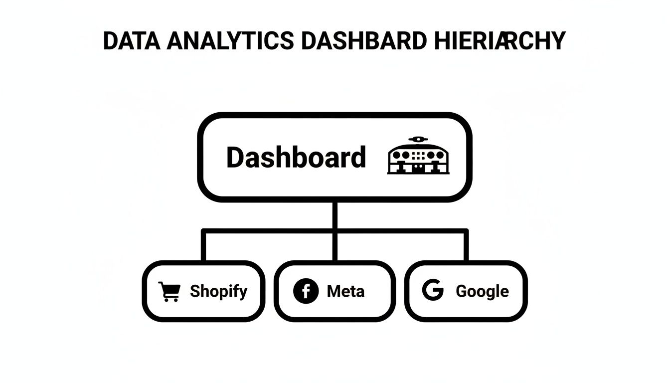
As you can see, a primary dashboard acts as a hub. It pulls critical data from Shopify for sales, Meta for social ads, and Google for search campaigns to create one unified source of truth.
The Granular Dashboard: Your Magnifying Glass
Finally, we have the granular dashboard—the media buyer's magnifying glass. This is the most detailed view of all, designed for deep, in-the-weeds optimization. It focuses on the performance of individual ads, ad sets, creatives, and even specific SKUs.
This is where the real-time, micro-decisions happen. A media buyer uses this dashboard to answer super-specific questions that can make or break a campaign:
Which of the five new video ads I launched yesterday is actually profitable?
Is a specific audience segment suddenly getting too expensive to target?
Is a particular product's ROAS dropping, possibly signaling an inventory or pricing problem?
By delivering this extreme level of detail, the granular data analytics dashboard gives ad buyers the power to make precise, data-backed adjustments on the fly. They can confidently kill a losing creative, scale up a winning ad, or ping the inventory team about a fast-selling product—all based on what the real-time profit and performance data is telling them.
Choosing the Right KPIs for Your Dashboards
A dashboard without the right Key Performance Indicators (KPIs) is just a collection of pretty charts. It's like having a car's dashboard that only shows you the radio station—sure, it's information, but it won't help you get where you're going or warn you if you're about to run out of gas. To make your dashboards genuinely useful, you have to move beyond decoration and zero in on the metrics that truly reflect the health of your business.
The secret is aligning the KPIs on each dashboard with a specific goal. The numbers you obsess over for Meta Ads will naturally be different from your core Shopify metrics because you're trying to answer very different questions. This discipline is what transforms a cluttered wall of data into a sharp, decision-making tool.
Leading vs. Lagging Indicators
The most powerful dashboards I've ever built strike a careful balance between two types of metrics: leading and lagging indicators.
Think of it like managing your health. Your current weight is a lagging indicator; it tells you the result of your diet and exercise over the past few weeks. The number of calories you eat today is a leading indicator; it predicts your future weight.
Lagging indicators like Revenue or Return on Ad Spend (ROAS) report on past results. Leading indicators like Click-Through Rate (CTR) or Ad Frequency predict future outcomes. A great dashboard tracks both so you know exactly where you are and can see where you're headed.
By keeping a close eye on your leading indicators, you can spot trouble and make adjustments before it ever shows up in your lagging indicators. For example, if you see your Ad Frequency on Meta creeping up, you can proactively swap out your creative before your audience gets burned out and your ROAS takes a nosedive.
To build a complete picture of performance, you need a mix of metrics from across your key platforms. Here’s a cheat sheet of the essential KPIs to monitor.
Essential KPIs Across Your Marketing Platforms
Metric Category | Essential Meta Ads KPI | Essential Google Ads KPI | Essential Shopify KPI |
|---|---|---|---|
Profitability | Return on Ad Spend (ROAS): Measures direct ad profitability. | Conversion Value / Cost: Google's version of ROAS, showing profit from spend. | SKU-Level Profitability: Identifies your most (and least) profitable products. |
Efficiency | Cost per Result: Shows how much you pay for a desired action (e.g., purchase). | Quality Score: A higher score lowers your costs and improves ad position. | Average Order Value (AOV): Measures the average spend per transaction. |
Audience/Traffic | Click-Through Rate (CTR): Indicates how well your ad creative resonates. | Search Impression Share: Shows your market share vs. competitors on keywords. | Customer Lifetime Value (CLV): Tracks the total value of a customer over time. |
Health & Prediction | Frequency: A leading indicator of ad fatigue. | Conversion Rate: Measures how effectively your landing page converts clicks. | Returning Customer Rate: Shows the strength of your customer retention. |
This table isn't exhaustive, but it's the foundation for a dashboard that gives you a truly holistic view—from the top of the funnel on your ad platforms all the way to bottom-line profitability in your store.
Essential KPIs for Meta Ads
On Meta, your primary goal is to gauge ad efficiency and how your creative is landing with your audience. You need to look beyond the final sale and track the metrics that lead up to it.
Cost per Result: This is your efficiency baseline. It tells you exactly what you’re paying for a purchase, lead, or whatever your objective is. If this number is climbing, your campaign is becoming less efficient.
Frequency: This shows the average number of times an individual has seen your ad. Once this number gets too high—say, above 3-4 in a short window—it’s a huge red flag for ad fatigue. Your performance is likely about to drop off a cliff.
Click-Through Rate (CTR): This is a direct measure of how compelling your ad is. A low or declining CTR is often the very first sign that your creative is going stale and needs a refresh.
Return on Ad Spend (ROAS): While it's a lagging indicator, ROAS is your ultimate measure of ad profitability. For a deeper look at this crucial metric, check out our guide on what ROAS is in digital marketing.
Key Metrics for Google Ads
With Google Ads, you're focused on capturing existing demand and winning against your competition. Your KPIs need to reflect not just how your ads are doing, but how they’re performing in the broader auction environment.
Search Impression Share: This is one of the most important—and often overlooked—metrics. It tells you what percentage of the time your ads were actually shown when they were eligible. A low Search Impression Share means competitors are consistently outbidding you or your ads have a poor rank, highlighting a massive opportunity for growth.
Quality Score: This is Google's rating of your ads, keywords, and landing pages. A high Quality Score is a powerful leading indicator; it directly leads to lower costs and better ad positions, fundamentally improving your account's health.
Conversion Rate: This tracks the percentage of clicks that turn into a sale or lead. This metric tells you how well your landing page and offer are aligned with the searcher's intent. A great ad with a poor conversion rate points to a problem on your site, not with your ads.
Must-Have KPIs for Your Shopify Dashboard
Your Shopify dashboard is mission control for your business's financial health. These KPIs zoom out from individual ad channels to give you a complete, holistic view of your e-commerce engine.
Average Order Value (AOV): Simply put, how much does the average customer spend in a single purchase? Increasing your AOV through upsells, cross-sells, or bundles is one of the fastest ways to boost revenue without spending more on traffic.
Customer Lifetime Value (CLV): This is the holy grail metric. It represents the total revenue you can expect to generate from a single customer over their entire relationship with your brand. A rising CLV means you're building real loyalty, which is always more profitable than acquiring a new customer.
SKU-Level Profitability: Don't get fooled by store-level revenue. A truly insightful dashboard breaks down profitability by each individual product (SKU). This immediately shows you which products are your cash cows and which are duds, guiding smart decisions on everything from marketing spend to inventory management.
How to Design Dashboards That Drive Action
The line between a genuinely useful dashboard and a digital paperweight is all about design. It's that simple. A great dashboard gives you the critical answers in seconds, letting you make confident decisions on the fly. A bad one just creates confusion, leads to data paralysis, and eventually, gets ignored by the team.
This isn’t about making your charts look pretty. It’s about making them instantly understandable.
The one rule I always come back to is the “10-second test.” Can a team member glance at your dashboard and grasp the main story in 10 seconds or less? If not, the design has failed. It’s time to go back and simplify. This simple test forces you to prioritize clarity over clutter, turning your dashboard into a real tool, not just a gallery of graphs.

Embrace Visual Hierarchy
When someone opens a dashboard, their eyes don’t just wander aimlessly. They follow a predictable path. In Western cultures, we read top-to-bottom, left-to-right. This creates a natural "Z" pattern, making the top-left corner of your dashboard the most valuable real estate you have.
This is exactly where your single most important metric needs to live. For a high-level strategic dashboard, this might be your blended ROAS or Net Profit. For a daily operational view, it could be total ad spend. We call this the “North Star” metric—it’s the one number that gives context to everything else on the page.
Your most critical metric should live in the top-left corner of your dashboard. This is the first place a user’s eyes will go, and it sets the stage for understanding all the other data presented. Don't make people hunt for the headline.
From that top-left anchor, arrange everything else in order of importance, following that natural flow down and to the right. Supporting metrics that explain the "why" behind your North Star can sit nearby, while more granular, detailed data can be placed toward the bottom.
Choose the Right Chart for the Job
I've seen so many dashboards rendered useless by this one mistake: picking the wrong chart type. Every type of chart has a specific job. Get it right, and the insight is obvious. Get it wrong, and you force your team to become data detectives just to figure out what they’re looking at.
Here’s a quick field guide for picking the right tool for the job:
Line Charts: These are your go-to for showing a trend over time. Perfect for tracking metrics like revenue, ROAS, or CPC over a series of days, weeks, or months.
Bar Charts: Use these when you need to compare values across different categories. Think campaign performance, channel results, or sales by product line.
Pie or Donut Charts: These are for showing parts of a whole—how different segments contribute to a total. They're great for things like traffic source breakdowns, but with a major warning: never use them for more than 5-6 categories. Any more than that and they become an unreadable mess.
Single Value Cards: When you have one critical number, put it in a box. These are perfect for your North Star metric (like total sales) or any other KPI that needs to be seen immediately.
When you match the chart to the story your data is telling, the whole dashboard becomes instantly scannable.
Use Color with Purpose
Color is a powerful tool in a dashboard, but its purpose is communication, not decoration. The rookie mistake is to splash a rainbow of colors across the screen to make it look "vibrant." All this does is create visual noise that makes it harder to see what's going on.
Instead, be disciplined and use color to guide the eye.
Start with a Neutral Palette: Build your dashboard with a simple base of neutral colors, like grays and muted blues. This is for your standard, everyday data.
Use Accent Colors for Highlights: Save your bright, high-contrast colors (like red or green) for things that demand attention. Green is great for showing positive growth, while red can instantly flag a number that's dropped below a critical threshold.
Stay Consistent: If Meta Ads are blue in one chart, they better be blue in every chart. Consistency removes ambiguity and helps your team process the information faster.
This strategic approach to color turns it into a powerful signal, pointing users directly to the most important takeaways and helping them ace that 10-second test.
Common Dashboard Mistakes and How to Avoid Them
It’s a story I’ve seen play out dozens of times. A team gets excited, builds a shiny new dashboard, and for a week, it feels like a window into the soul of the business. But soon enough, it gathers digital dust, becoming a confusing mess that no one trusts.
Building a great dashboard isn't just about plugging in your data. It’s about side-stepping the common traps that turn a tool for clarity into a source of chaos. Let's walk through the three biggest mistakes so you can avoid them from the start.
The Wall of Noise
The most common mistake? Trying to show everything. The dashboard becomes a "wall of noise"—dozens of charts, graphs, and numbers all screaming for attention. It might look impressive to an outsider, but for the team using it, it’s just overwhelming.
When everything is presented as equally important, nothing is. It becomes impossible to spot the real signal. Instead of finding answers, your team gets data anxiety and eventually just stops looking at it altogether.
How to Avoid It:
Be ruthlessly selective. Before adding any chart, ask a simple question: "What specific decision will this help us make?" If you don't have a crystal-clear answer, it doesn't belong.
Create a hierarchy. Don't try to cram strategic, operational, and granular views onto one screen. Build separate, focused dashboards for different purposes.
Clarity over quantity. Your goal isn’t to display data; it’s to communicate insight. Less is almost always more.
Real-Time Data and Analysis Paralysis
The idea of real-time data is tempting, but it’s a double-edged sword. Watching metrics bounce around minute by minute can lead to constant, reactive tinkering—a habit I call "over-editing." This rarely helps and often hurts, disrupting campaign algorithms and creating volatility.
Imagine a marketer sees their CTR dip for a few hours. They panic, swap out the ad creative, and the next day, ROAS has tanked. Why? They pulled the campaign out of its learning phase for a fluctuation that wasn't statistically significant.
This is a huge problem. Even though real-time dashboards are becoming more common, a recent market analysis found that 49% of leaders still struggle to get reliable, timely data. In ad operations, this leads to an estimated 20-30% of spend being wasted on tweaks driven by noise, not insight.
Overreacting to short-term data fluctuations is one of the fastest ways to destroy a successful campaign. A great dashboard helps you see the trend, not the turbulence.
How to Avoid It:
Set action thresholds. Create simple rules of engagement. For example: "I will only investigate a performance drop if ROAS is below 2.5 for 48 consecutive hours."
Focus on the trendline. Use longer time windows, like 7-day or 14-day views, to smooth out the daily bumps and see what’s actually happening.
Respect the learning phase. Give new campaigns and ad sets the time they need to find their footing. Don't make knee-jerk changes based on a few hours of data.
Vanity Metric Blindness
The final trap is getting blinded by vanity metrics. These are the top-line numbers that sound impressive but don't actually tell you if your business is healthy. Things like impressions, page views, and even total revenue can look great on paper while hiding serious problems just beneath the surface.
Sure, a campaign might be racking up millions of impressions, but if it’s reaching the wrong audience, you're just burning cash. Likewise, revenue might be climbing, but if your profit margin is getting crushed by rising ad costs, your business is actually getting weaker.
Relying on vanity metrics is like admiring the glossy paint job on a car with a failing engine.
How to Avoid It:
Prioritize profitability. Make metrics like SKU-level profitability, Contribution Margin, and Net Profit the stars of your dashboard.
Track leading indicators. Keep a close eye on health metrics like Ad Frequency and Cost per Result. These are your early warning system—they'll signal trouble long before your lagging indicators (like ROAS) start to drop.
Tie every metric to a goal. Make sure every single KPI on your dashboard has a direct line to a core business objective. If it's just there to look good, cut it.
Moving from Insights to Intelligent Action

Let's be honest, a well-built data analytics dashboard is an incredible diagnostic tool. It’s fantastic for answering the "what" questions. What were yesterday's sales? What was our ROAS? What are our top-selling products?
But knowing what happened is only half the battle. The most important question any operator can ask is, "So, what should I do about it?"
This is the exact point where most businesses get stuck. Your dashboard might clearly show that ROAS dropped by 15%, but it won't tell you why. Was it creative fatigue setting in? Did you saturate an audience? Was it a pricing change on your website? You're left to connect the dots on your own, which often leads to reactive, gut-feel decisions that can easily make things worse.
Think of it this way: the dashboard tells you the patient has a fever, but it can’t write the prescription. For that, you need a clear diagnosis and a treatment plan.
Beyond Dashboards: The Execution Layer
The gap between seeing a problem and knowing how to fix it is where an execution layer comes into play. Instead of just displaying data points, an execution system digs into the "why" behind the numbers and then recommends specific, prioritized actions to take. It essentially adds an intelligent layer on top of your data, turning raw observations into a concrete to-do list.
For instance, imagine your dashboard flags that performance dip. An execution system like SpendOwlAI takes the analysis a critical step further. It might pinpoint that the ROAS drop is coming from creative fatigue in one specific Meta ad set that's been live for 22 days. Better yet, it would surface a creative refresh as your top priority.
This changes the game entirely. You shift from being a data interpreter, spending hours digging through ad accounts, to being a decisive operator. Your day starts with a clear, ranked list of what actually needs your attention.
Dashboards show you the problem; an execution system tells you how to fix it. It's the difference between seeing a warning light on your car's dashboard and having a mechanic hand you the exact tool you need with a clear set of instructions.
Turning Insights into Daily Tasks
An execution system doesn't make your dashboards obsolete. It makes them more powerful by finally closing the loop between data and action. It analyzes performance trends across all your platforms, looking for meaningful shifts while learning to ignore the statistical noise that sends so many teams on wild goose chases.
This interface highlights a specific, high-priority action—pausing an underperforming ad—and provides the exact data points that justify the decision. It completely removes the guesswork and gives operators the confidence to act swiftly.
This approach delivers some serious benefits:
Saves Time: It cuts out hours of manual data-crunching, freeing up your team to focus on bigger-picture strategy and creative work.
Reduces Wasted Spend: By flagging problems like ad fatigue or audience saturation early, it stops you from burning cash on campaigns that are past their prime.
Enables Confident Decisions: With clear, data-backed recommendations, you know you’re making the right calls, not just reacting to daily performance swings.
Connecting your data to a system that prioritizes action is the final, crucial step in building a truly data-driven operation. To get a better sense of how different data points are connected and analyzed, you might find our guide to marketing attribution software helpful.
Frequently Asked Questions
Let's tackle some of the most common questions we hear about e-commerce dashboards. Think of this as a quick-start guide to putting these principles into practice right away.
How Often Should I Check My E-commerce Dashboards?
That's a great question, and the honest answer is: it depends on what you’re looking at.
For your big-picture strategic dashboards, a weekly or even monthly check-in is perfect. You’re looking for long-term trends, not daily blips. But for operational dashboards, like your ad performance, you'll want to glance at those daily. This is your early warning system for any sudden campaign issues.
The real skill is learning to see the forest for the trees. A good data analytics dashboard is your guide for making informed moves, not a panic button that has you tweaking campaigns every five minutes.
What Is the Biggest Mistake People Make with Dashboards?
Without a doubt, the most common mistake is building a "data graveyard." This happens when you cram a dashboard with dozens of metrics, creating a wall of noise that nobody actually understands or uses. Instead of providing clarity, it just causes data paralysis.
A great dashboard is focused. It’s designed to answer specific business questions, not show you everything all at once.
The goal of a dashboard is to deliver insight at a glance. If you can't understand the key takeaways in under 10 seconds, the design has failed. Simplicity is always more powerful than density.
Can I Build a Powerful Dashboard with Free Tools?
Yes, absolutely. You don't need to break the bank to get started.
Tools like Google Looker Studio are incredibly powerful and completely free. You can connect it directly to your Google Ads, Google Analytics, and even Google Sheets data. This gives you more than enough firepower to build comprehensive dashboards for both strategic and operational tracking.
While some paid tools offer fancier connectors or automation, you can build a highly effective dashboard system with zero initial investment. Focus on a clean design and the right KPIs first—the tools are secondary.
What Is the Difference Between a Dashboard and a Report?
Think of it this way: a dashboard is the live cockpit of your car. It gives you real-time speed, fuel level, and engine warnings so you can react now. A report, on the other hand, is the detailed summary you get from your mechanic after a long road trip—a static, in-depth analysis of what happened in the past.
Dashboards are built for immediate monitoring and quick decisions. Reports are designed for deep-dive analysis and bigger strategic planning. You need both to run your business well, but they serve very different purposes.
While dashboards show you what happened, SpendOwlAI tells you why it happened and what to do next. It analyzes your performance data to deliver a prioritized list of explainable actions for your Meta and Google ads, turning insights into confident execution. Stop guessing and start making data-backed decisions by exploring SpendOwlAI.