Presenting the Data for Impactful Ad Performance
We’ve all been in that meeting. The one where slide after slide is just a screenshot from a Meta or Google Ads dashboard. It’s a classic data dump, and it usually leaves everyone feeling more confused than confident. The real goal isn't just to show numbers; it's to tell a story that leads to smart decisions.
Move from Data Dumps to Actionable Insights

Let's be honest: most marketing and e-commerce teams are swimming in data. The problem isn't a lack of metrics from platforms like Shopify, it's the overwhelming noise. Reporting devolves into a chore of exporting spreadsheets and pasting charts, which does little to explain why performance changed.
Truly effective data presentation is all about prioritization and context. It’s your job to cut through the clutter and guide your team. This means moving away from reactive, gut-feel decisions and toward a framework where your data provides clear, explainable actions.
The Old Way vs. The New Way of Presenting Data
Shifting from just reporting numbers to telling a data story is a fundamental change in mindset. It’s the difference between causing confusion and building conviction.
Here’s a quick breakdown of the two approaches:
Attribute | Traditional Reporting (The Noise) | Action-Oriented Presentation (The Clarity) |
|---|---|---|
Focus | Shows what happened (e.g., ROAS dropped). | Explains why it happened and what to do next. |
Structure | A collection of disconnected charts and tables. | A cohesive narrative with a clear recommendation. |
Metrics | Overloads with vanity metrics (e.g., impressions). | Prioritizes impactful KPIs (e.g., CPA, budget pacing). |
Outcome | Leads to analysis paralysis and more questions. | Drives decisive action and measurable results. |
This shift toward clarity isn't just a nice-to-have; it's a necessity. With the global digital advertising market expected to reach $354.9 billion by 2026—growing at a 13.8% compound annual rate—the stakes are higher than ever. Managing this kind of volatility requires you to explain performance, not just report it.
The most valuable presentations don't just display data; they interpret it. Your job is to be the translator who turns numbers into a strategic plan, telling your team what deserves attention and, just as importantly, what should be left alone.
Ultimately, mastering this skill is about building trust. When you can confidently walk into a room, explain a sudden shift in performance, and back up your recommendations with solid evidence, you empower your entire team to act with purpose. This foundation is a core component of building a successful advertising program, which we explore further in our guide on data-driven marketing solutions.
By focusing on what truly matters, you can stop reacting and start executing with data-backed confidence.
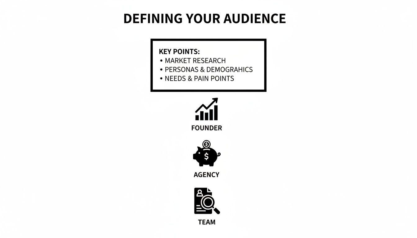
Define Your Audience and Core Objectives
Before you pull a single number or open a slide deck, stop. The single biggest mistake I see people make is diving headfirst into the data without a plan. You have to ask yourself two simple questions first: Who am I talking to? And what do I need them to know or do?
Without answering those, you’re just throwing numbers at a wall and hoping something sticks. Your presentation isn't just a data dump; it's a conversation with a purpose. If you don't frame your data around your audience's world, you'll lose them before you even get to your main point.
Tailor Your Message to the Stakeholder
The same performance data can—and should—tell completely different stories. A founder and a marketing manager care about different things, so giving them the same report is a surefire way to get blank stares.
Talking to a Founder? They live and breathe the big picture: profitability, cash flow, and high-level growth. Forget the day-to-day CPC swings. Instead, anchor your story in metrics like overall Return on Ad Spend (ROAS), the ratio of customer acquisition cost (CAC) to lifetime value (LTV), and how you're chipping away at market share. Your job is to connect the dots between ad spend and the health of the business.
Presenting to an Agency? Their focus is on performance, efficiency, and keeping you, the client, happy. They need to see that their strategy is working and that their budget is being managed responsibly. I’ve found it’s best to highlight campaign-level wins, budget pacing, and the results from any A/B tests. Show them you're a good steward of their investment and always looking for the next optimization.
Huddling with the Growth Team? This is where you can really geek out. This team is deep in the trenches, looking for any edge they can find to scale wins and optimize the funnel. Go ahead and get granular. Talk about creative fatigue, audience saturation, and even SKU-level performance. They want the nitty-gritty details to find those incremental gains.
Set a Clear and Actionable Objective
Once you know who you're talking to, you need to decide what the point of the meeting is. What action do you want to drive? Are you asking for more budget? Proposing a new strategy? Sounding the alarm on a problem?
A presentation without a clear objective is just a report. A presentation with an objective is a proposal for action. It shifts the dynamic from a passive review to an active decision-making session.
Get specific. "Reviewing performance" isn't an objective; it's an activity. A real objective is tied to a tangible business outcome and gives your entire presentation a clear focus.
Think in terms of concrete goals like these:
The Ask: Secure a 20% budget increase for our top-performing Google Ads campaign by proving its killer ROAS and untapped potential.
The Pivot: Get the green light to pause three underperforming Meta ad sets by showing a steady decline in CTR and a troubling rise in CPA.
The Investment: Convince leadership to fund new creative production by presenting clear data on creative fatigue across our most important campaigns.
When you start with a clear objective, it acts as a filter for everything you include. Every chart, every number, and every talking point should directly support your core ask. This changes your role from someone who just reports the news to a strategic guide who uses data to move the business forward. This is how you turn a routine update into a genuine catalyst for growth.
Choose Visuals That Tell a Clear Story
You've nailed down your audience and your core message. Now comes the part where many presentations fall flat: choosing the right visuals. A great chart can make your point in a heartbeat, but a poorly chosen one will just muddy the waters or, even worse, lead your audience to the wrong conclusion. This isn't about making data pretty; it's about making it understood in seconds.
Generic, out-of-the-box charts simply won't do the job here. When you're presenting ad performance data, every single visualization needs to have a clear purpose. It's all about matching the chart type to the specific insight you want to pull from the numbers.
Match the Chart to the E-Commerce Question
Think of different charts as specialized tools, each designed to answer a different kind of question. A pie chart showing ad spend distribution is often a waste of space. But a line chart tracking your Cost Per Acquisition (CPA) over time? That tells a powerful story about campaign efficiency.
Here’s a quick guide for common e-commerce scenarios:
Line Charts for Trends: When you need to show how a metric like ROAS, CPA, or ad spend has changed over time, a line chart is your best friend. It’s the perfect way to visualize how a new Meta Ads campaign’s ROAS ramped up over its first 14 days.
Bar Charts for Comparisons: These are the champs for comparing metrics across different categories. A simple bar chart can instantly show which of your top five ad creatives has the highest Click-Through Rate (CTR) or which audience segment is bringing in the most conversions.
Scatter Plots for Relationships: Ever wonder if two metrics are connected? A scatter plot is what you need. You could plot CTR against conversion rate for a dozen different ads to see if higher engagement really does translate to more sales.
Heat Maps for Hot Spots: These are fantastic for spotting patterns in a sea of data. A heat map can show you ad performance by hour of the day and day of the week, immediately flagging the best times to push your bids or showing you when creative fatigue might be setting in.
Visualizing for Different Stakeholders
Picking the right chart is only half the battle. The visuals you present must also speak directly to the concerns of your audience, because each stakeholder is looking for different signals in the data.
As you can see, a founder needs to see the big picture on profitability. An agency lead wants to see proof of budget efficiency. And your internal growth team needs granular data they can use to find the next optimization opportunity.
This level of clarity is becoming non-negotiable. With social media ad spend projected to hit $219 billion in 2026—a 14% jump from 2024—the pressure on Shopify store owners and agency teams to justify their ad budgets will only intensify. As you can see from these digital marketing statistics, the demands are growing. Clean, insightful visuals are your best defense.
The ultimate test for any visual is this: can someone understand the main takeaway in five seconds without you saying a word? If not, simplify it. Remove unnecessary labels, use color strategically, and add a clear title that states the conclusion.
For example, don't just title a chart "ROAS Over Time." Instead, make it "ROAS Increased 15% in Q2 After New Creative Launch." This hands the insight to your audience on a silver platter.
Practical Examples for Ad Performance Data
Let's make this real. Imagine you're walking your team through your latest Google Ads performance report.
To Show Creative Fatigue: Your best bet is a dual-axis line chart. Plot CTR on one axis and CPA on the other over a 30-day period. You can then point to the exact moment the CTR line starts to sag and the CPA line begins to creep up, giving you a data-backed case for a creative refresh.
To Justify a Budget Shift: A stacked bar chart showing conversion volume by campaign is perfect for this. If you color-code the bars to show new versus returning customers, you can build a powerful argument for shifting budget to a campaign that's not only efficient but also bringing in valuable new business.
In the end, your visuals are the backbone of your data story. By choosing charts that are purpose-built for the insight you're sharing, you stop just showing numbers and start guiding your audience to a clear, data-driven conclusion. It’s what makes your recommendations both compelling and impossible to ignore.
Build a Persuasive Narrative Around Your Numbers
Your charts and graphs are just ingredients. The real magic happens when you combine them into a story that leads your audience from a challenge to a clear solution. This is where you connect the dots and turn raw data into a compelling case for action.
Too many people present data chronologically. They walk through their process step-by-step and hope the audience eventually arrives at the same conclusion they did. That's a huge mistake.
Flip the script. Start with the "so what"—the single most important takeaway—and then use your visuals to show everyone exactly how you got there.
Start with the Conclusion First
Picture this: you walk into a meeting and your first words are, "Our ROAS dropped by 10% last week." Immediately, the room tenses up. Your stakeholders are now on the defensive, looking for someone or something to blame.
Now, try it this way: "I’ve found an opportunity to significantly improve our ROAS. It involves shifting budget from two fatigued ad sets into a top-performing campaign. Let me walk you through the data that led me here." See the difference? You’re no longer just a bearer of bad news; you're a strategic problem-solver who has already found the way forward.
People remember stories, not spreadsheets. When you structure your presentation with a clear beginning (the problem), middle (the analysis), and end (the recommendation), you create a logical arc that anyone can follow, no matter their data expertise.
This method respects everyone's time by giving them the headline right away. It’s the difference between a confusing mystery and a powerful, well-argued thesis.
Frame Analysis Around Business Questions
Your stakeholders don't really care about a guided tour of your analytics dashboard. They have real, pressing business questions they need answered. Every single chart you show should be framed as a direct answer to one of those questions.
Don't just say, "Here's our CTR for the past 30 days." That’s just noise.
Instead, tie it to an actual business problem. "Last week, the team asked why our top-of-funnel costs were climbing. This chart shows a steady decline in CTR for our main prospecting audience, which has been driving up our CPC."
This simple reframing does two critical things:
It shows you’re listening to their concerns and have put in the work to find answers.
It gives the data immediate context. The chart is no longer an abstract metric; it's the key piece of evidence solving a business puzzle.
Getting good at this means knowing which questions to ask in the first place. You can learn more about how to do that in our guide on why segmentation is important for targeted analysis.
Justify Every Recommendation with a Clear Rationale
The final, and most crucial, part of your story is connecting every recommendation back to undeniable data. Never, ever suggest an action without clearly explaining the "why." Your job is to make your conclusion feel like the only logical outcome.
This is especially important when you're asking for something, whether it's more budget, a creative pivot, or headcount.
Let's look at how to justify a budget increase:
The Wrong Way: "We need more budget for Campaign X. Its ROAS is good." This is a weak claim that just invites questions and skepticism.
The Right Way: "I'm recommending we increase the budget for Campaign X by 20%. For the last 14 days, it’s consistently delivered a 4.5x ROAS, even as we’ve scaled spend. Our ad frequency is still low, so we haven't saturated the audience yet. Most importantly, this single campaign is driving 30% of all our new customers. A budget increase right now lets us double down on our most profitable customer acquisition channel."
The second approach is powerful. It anticipates objections and answers them with a layered, data-backed argument—combining ROAS, scale, audience saturation, and new customer value. It transforms an opinion into a data-driven business case that's hard to argue with.
When you master this narrative approach, you stop being a data reporter and become a strategic guide. You're not just showing numbers; you're interpreting them and leading your team toward smarter, more profitable decisions.
Avoid Common Data Presentation Pitfalls

You can build the perfect narrative and have stunning visuals, but a few common mistakes can completely derail your presentation. I've seen it happen time and again. These pitfalls turn a moment of clarity into an exercise in confusion, eroding trust and leading the team to make the wrong calls.
The tricky part is that these mistakes often come from a good place—a desire to be thorough or completely transparent. But in the end, they just muddy the waters. Steering clear of them is what separates a data report from a decision-making tool.
Sidestep the Trap of Context Blindness
I see this all the time: someone proudly states, "Our ROAS was 3.5x last week." On its own, that number is meaningless. Is that good? Better than last month? Are we hitting our targets? Without context, a number is just noise.
Your data only becomes meaningful when you anchor it to a benchmark. Every time you present a metric, you need to be ready to answer these questions:
How does this compare to the past? For example, "ROAS is up 15% from the prior month."
How does this stack up against our goal? For instance, "We're 10% above our target ROAS of 3.2x."
Where is this performance coming from? You can break it down by channel, campaign, or audience to pinpoint what's working.
Of course, interpreting your numbers starts with clean data. If your tracking isn't set up right, you can't trust the context anyway. A solid UTM structure is non-negotiable. If you need a refresher, our guide on using UTM parameters for Google Analytics is a great place to start.
Overcome Analysis Paralysis
The flip side of too little context is just as bad: burying your audience in data. This is analysis paralysis. It’s what happens when you throw every chart and spreadsheet you have into the deck, hoping your stakeholders will magically find the one important insight.
Your job is to curate, not just compile. A presentation with twenty dense slides is a clear sign that the presenter didn't do the hard work of finding the actual story.
A successful presentation is defined not by what you include, but by what you consciously choose to leave out. Find the one or two critical insights that support your recommendation and cut the rest.
You can always keep extra charts in an appendix if people ask for more detail. But never lead with the data dump. Every single visual should have one clear job: to support your core message.
Resist Noise-Driven Recommendations
Not every wiggle in the data means you have to do something. A classic mistake is spotting a one-day dip in performance and immediately calling for a major strategic change. This knee-jerk reaction often does more harm than good, especially with ad platforms that need time and stability to optimize.
Seasoned pros know how to tell the difference between signal and noise. A single day of high CPA could just be a random blip. A steady five-day upward trend? That's a signal you need to investigate.
Avoid reactive, noise-driven decisions by focusing on sustained trends. Before you declare creative fatigue, for example, look for a consistent drop in CTR and a matching rise in CPA over at least a 7 to 14-day period. Presenting data with this level of patience shows you're thinking strategically, not just reacting.
Guard Against Premature Scaling
This is one of the most tempting traps. You launch a new ad, it gets a fantastic ROAS on day one with just $20 in spend, and you're ready to pump thousands of dollars into it.
Stop right there. That’s a recipe for burning through your budget. Early performance on low spend is rarely a true indicator of how an ad will perform at scale. The audience is tiny, and a couple of lucky conversions can make your efficiency metrics look way better than they actually are.
Instead of jumping the gun, take a more methodical approach. Here's how I handle it:
Validate. Let the ad run for a few days to get out of the learning phase and gather more stable data.
Test Incrementally. Start increasing the budget slowly, maybe by 20-30% at a time.
Monitor Efficiency. Keep a close watch on your core KPIs like CPA and ROAS as you spend more.
When you present a plan for controlled scaling, you show stakeholders you're managing risk, not just chasing a spike on a chart. It proves you’re focused on responsible growth, and that’s how you build real confidence in your work.
Answering Your Toughest Questions on Presenting Data
Knowing the framework is one thing, but standing in front of your team or CEO is another. Even the sharpest marketers I know run into the same handful of questions when it’s go-time. Let's walk through the most common ones I hear so you're ready for them.
How Often Should I Be Presenting Data to Stakeholders?
The right answer depends entirely on who’s in the room and what they need to know. A one-size-fits-all reporting schedule just creates noise and wastes everyone's time. You have to match the frequency to the meeting's purpose.
Here’s how I typically see this break down in healthy organizations:
For the hands-on manager: A quick, personal check-in on core metrics should be a daily habit. This isn't a formal presentation; it's your daily pulse check to spot any immediate problems with spend, delivery, or core KPIs before they spiral.
For your immediate team: In weekly tactical meetings, you want to focus on trends, not daily blips. What did you learn from last week's tests? What's the plan for the next seven days? This is all about tactical alignment and sharing what's working (and what's not).
For leadership and founders: When you're in the big monthly or quarterly reviews, zoom way out. These folks don't need to know about CTR fluctuations on a specific ad. They need to see the strategic story. Stick to month-over-month and quarter-over-quarter trends in profitability, customer acquisition costs, and how you’re tracking against the overall budget.
What Is the Single Most Important Metric for E-commerce Ad Data?
It’s tempting to look for a silver bullet, but the “most important” metric is always tied to your specific business goals. That said, for almost any e-commerce brand, the conversation has to be anchored in profitability. That makes Return on Ad Spend (ROAS)—or even better, Margin on Ad Spend (MOAS)—your north star.
But here’s a rookie mistake I see all the time: presenting ROAS by itself. A sky-high ROAS on tiny spend isn't a win; it's a sign you’re not being aggressive enough. To tell the full story, you need a balanced scorecard.
A single metric tells a chapter, but a combination of metrics tells the whole story. You absolutely must pair your profitability metric with others that show scale and efficiency.
For example, a really effective presentation slide would feature your primary metric, like ROAS, right alongside supporting KPIs like Cost Per Acquisition (CPA) and total Conversion Volume. That simple trio perfectly illustrates the balance between efficiency and growth, which is what every leader really wants to understand.
How Do I Present Data About Creative Fatigue Effectively?
This is a fantastic opportunity to let the data do the talking for you. Don't walk into a room and say, "I think this ad is getting stale." Instead, build a clear, data-backed case that's impossible to ignore.
Start by showing a line chart that tracks the creative’s key metrics over time. You want to pinpoint the exact moment performance started to dip. Show them how the Click-Through Rate (CTR) started to fall, and then, a few days later, how the Cost Per Acquisition (CPA) began to climb as a direct result.
Then, you wrap it up with a confident, action-oriented conclusion: "As you can see, this creative seems to have hit its saturation point. We've tracked a 30% decline in CTR and a corresponding 25% increase in CPA over the last 14 days. It's time to cycle in fresh creative to re-engage the audience and bring our campaign efficiency back up."
How Can I Keep My Presentation High-Level but Still Data-Driven?
The trick to keeping senior leaders engaged—without getting lost in the weeds—is to use an "executive summary first" approach. Start your entire presentation with one slide that delivers your one to three biggest takeaways. Give them the conclusion right at the top.
For example: "This month, we successfully scaled our ad spend by 10% while also increasing our overall ROAS by 15%. The key driver was shifting budget from two underperforming campaigns into our new top-of-funnel video assets."
Boom. They have the story. The slides that follow are simply the evidence. Use clean, simple charts with annotations that draw their eyes to the most important data points. And always, always have your detailed backup data ready in an appendix, but don’t show it unless someone asks to drill down. This approach lets you control the narrative while showing you’ve done your homework.
Stop wasting time on noisy dashboards and start taking clear, decisive action. SpendOwlAI delivers a daily ranked list of what to change in your ad accounts, ordered by impact and backed by transparent rationale. Start your free 7-day trial and execute with confidence.