A DTC Guide to Optimize Website Conversions and Spark Growth
Before you touch a single button color or rewrite a headline, you need to play detective. The first, and most important, step in conversion optimization is figuring out where people are leaving your site and why. This all starts with a practical funnel audit, where you'll mix hard numbers from your analytics with real-world user behavior.
Your Foundation for Growth: A Practical Funnel Audit
Jumping straight into A/B testing is like trying to fix a car engine by randomly tightening bolts—you might get lucky, but you're more likely to waste time or make things worse. A systematic funnel audit is what separates guessing from a real, evidence-based strategy. It’s about seeing your website through your customers' eyes to find the exact moments of friction that are killing your conversions.
Let's say you're running a bustling Shopify store. You're pouring money into Meta and Google ads, but most of your visitors vanish without buying a thing. Sound familiar? It's a common story.
Recent data shows the global average e-commerce conversion rate is a sobering 1.9% to 2%. That means for every 100 visitors, only about two will actually make a purchase. Shopify stores tend to do a bit better, averaging around 2.5-3%, but the top performers blow these numbers out of the water. That gap is where focused optimization makes all the difference.
The Power of "What" and "Why"
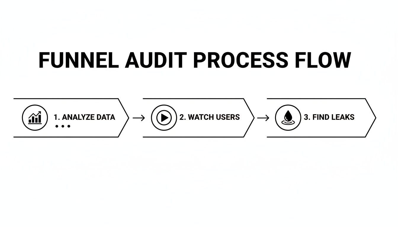
The best audits don't just look at numbers; they uncover the stories behind them. To do this, you need to blend two types of data.
Quantitative Data (The "What"): This is your numerical evidence from platforms like Google Analytics. It tells you what is happening at each stage of your funnel—how many people land on your homepage, view a product, and start the checkout.
Qualitative Data (The "Why"): This is where you get the context. Tools like Hotjar or Microsoft Clarity provide session recordings and heatmaps, letting you watch why users are dropping off by observing their actual on-screen behavior.
This simple flow shows how these two pieces fit together perfectly. You start with the data, watch real users to understand their struggles, and then you know exactly where the leaks are.
A complete audit isn't just about staring at charts. It's about watching real people interact with your site to see the full story.
Finding the Holes in Your Funnel
First things first: you need to map out the exact steps a customer takes to convert on your site. For a typical e-commerce store, the journey looks straightforward, but every single step is a potential exit ramp for your visitors.
A standard e-commerce funnel usually includes these key stages:
Homepage / Landing Page: The first handshake. Do they stick around or bounce?
Category / Product Listing Page: Where they browse and compare their options.
Product Detail Page (PDP): The make-or-break page where the purchase decision gets serious.
Cart Page: The final review before they commit.
Checkout Process: The last mile—shipping, billing, and payment.
Thank You Page: The confirmation. You've made the sale!
Your first job is to track these stages in your analytics and measure the drop-off rate between each one. If you see a 70% drop-off between adding an item to the cart and starting the checkout, you've just found a massive red flag. The culprit is often something like unexpected shipping costs or a painfully long form.
To put your own numbers in perspective, it helps to see how you stack up against others.
Conversion Rate Benchmarks by Channel and Industry
This table offers a quick reference for average conversion rates, giving you a baseline to compare your own performance against.
Channel / Industry | Average Conversion Rate |
|---|---|
E-commerce (Overall) | 1.9% - 3% |
Paid Search (Google Ads) | 3.75% |
Organic Search (SEO) | 2.8% |
Social Media Ads | 1.5% |
Email Marketing | 4.2% |
Fashion & Apparel | 2.4% |
Health & Beauty | 3.1% |
Electronics | 1.7% |
While these are just averages, they provide a crucial gut-check. If your numbers are way off, it’s a clear sign that something in your funnel needs attention.
A common mistake is obsessing over the product page. I've seen countless sites where the biggest conversion leaks were actually hiding in the checkout sequence, a place where trust and simplicity are everything.
Turning Data into Action
Once you've spotted a major drop-off point in your analytics, it's time to switch hats and become a user behavior analyst. Go to your qualitative tools.
Let’s say you noticed a high exit rate on your mobile cart page. The next step is to filter for session recordings of mobile users who abandoned their carts. After watching a few, you might discover a promo code field is confusing, a button is impossible to tap with a thumb, or the page just loads too slowly on a 4G connection.
Suddenly, abstract numbers become a concrete to-do list of problems to fix. You might also find it helpful to explore how user segmentation can reveal hidden patterns in your data.
By combining these approaches, you stop guessing. You'll know exactly where to focus your energy for the biggest impact on your bottom line.
Quick Wins to Plug Leaks and Boost Trust
Now that you have your audit data, it’s time to get some quick wins. Forget about massive site overhauls for a moment. Instead, we’re going to focus on plugging the most obvious leaks in your funnel.
From my experience, these initial fixes almost always come down to two things that make or break a user's decision to buy: speed and trust.

Too many teams get bogged down debating headline copy or button colors. Those A/B tests have a place, but their impact is tiny compared to fixing a page that takes forever to load or a checkout process that looks sketchy. Getting these fundamentals right creates a solid foundation you can actually build on.
Make Your Website Fast. Really Fast.
In a world where attention is measured in seconds, site speed isn’t some back-end technical task—it's a direct lever for revenue. A slow website doesn't just feel annoying; it feels broken. It tells a potential customer you don't care about their experience, sending them straight to your competitors before they even see what you're selling.
The numbers are brutal. Just a one-second delay in page load time can kill your conversions. Stretch that out to five seconds, and the chance of a visitor bouncing skyrockets by 90%.
If you're running Meta and Google ads to a Shopify store, a fast site is non-negotiable. It keeps ad-driven visitors on the page and even helps your organic rankings. With cart abandonment rates hitting over 70% in 2024—often due to unexpected friction—you can't afford to make users wait. You can dig deeper into these concepts in this detailed guide from Fermat Commerce.
Here are a few high-impact fixes you can implement right away:
Compress Your Images: This is the #1 offender. Huge, unoptimized images will cripple your load times. Use a tool like TinyPNG or the built-in compression on your e-commerce platform to drastically reduce file sizes without sacrificing quality.
Implement Lazy Loading: This is a simple but powerful trick. It tells the browser not to load images that are "below the fold" until the user actually scrolls down to them. This makes the initial page view feel almost instant.
Use a Content Delivery Network (CDN): A CDN is like having mini-versions of your site stored on servers all over the world. When someone visits, the content is served from the server closest to them, which is a game-changer for international traffic.
Build Unshakeable User Trust
Right after speed, trust is the most important thing you can build. Every single element on your site is either adding to that trust or chipping away at it. The moment a user has to pull out their credit card, they need to feel 100% confident. This is especially true for cold traffic coming from an ad who has never heard of you before.
Think about it like a physical retail store. You feel good in a clean, well-lit shop with clear signs and helpful staff. You immediately want to leave a cluttered, confusing store where you can't find anything. Your website is no different.
"A first-time visitor makes a snap judgment about your brand's credibility in milliseconds. Social proof and clear security signals aren't just decorations; they are essential tools for overcoming the initial skepticism of a new buyer."
Here are the most effective ways I've seen to build that instant credibility and get people through the checkout.
Simplify Your Checkout Experience
Your checkout needs to be the smoothest, most frictionless part of your entire website. Every extra field you ask for is another reason for someone to get frustrated and leave.
We've all been there: you're excited to buy something, and suddenly the site is demanding your phone number, your birthday, and forcing you to create an account with a complex password. The excitement dies instantly.
A great checkout experience always includes:
A Guest Checkout Option: Never, ever force someone to create an account to give you money. Let them buy as a guest and offer them the chance to create an account on the "Thank You" page after the sale is complete.
Minimal Form Fields: Only ask for what is absolutely critical to ship the order. Do you really need their company name for a t-shirt order? Probably not.
A Visual Progress Bar: Show people where they are in the process (e.g., Shipping > Billing > Review). It’s a small thing that manages expectations and makes the process feel faster and less intimidating.
Showcase Powerful Social Proof
People don't trust brands; they trust other people. That's why authentic social proof is one of the most powerful tools you have for building credibility fast.
Don't just slap it anywhere. Place these elements where they will have the most impact:
Customer Reviews and Ratings: Put star ratings right under the product title on your product pages and even on your category pages. It’s an immediate signal of quality.
User-Generated Content (UGC): Nothing sells a product like seeing a real person using and loving it. Feature customer photos prominently. They feel far more genuine than slick, professional shots.
Security Badges and Trust Seals: Add logos from well-known payment providers (Visa, PayPal) and security companies (Norton, McAfee) right next to your "Place Order" button. This small visual cue can be the final nudge someone needs to overcome their last-second hesitation.
Shifting from Quick Fixes to a Real A/B Testing Engine
Okay, so you’ve patched the obvious holes and plugged the low-hanging fruit leaks. But now, you've hit a wall, and growth has flatlined. This is the moment where the real work of conversion optimization begins.
Sustainable, long-term growth doesn't come from random tweaks or chasing the latest trend. It’s born from a disciplined, scientific process of continuous testing. It’s time to stop guessing and start building a structured A/B testing program that churns out reliable wins. This is how you move from asking your team, "What should we test next?" to using the data you've already collected to make incredibly smart bets.

From Vague Ideas to Testable Hypotheses
Every meaningful A/B test is built on a solid hypothesis. This isn't just a shower thought; it’s a formal statement that connects a specific change to an expected, measurable outcome. A good hypothesis forces you to articulate the why behind your test, which is absolutely critical for learning—especially when a test doesn't pan out.
I’ve found this simple framework to be incredibly effective: "If we [change X], then [outcome Y] will happen, because [reason Z]."
Let’s see it in action. Imagine your session recordings show mobile users hovering over the "Add to Cart" button but hesitating. Your gut says the generic button copy just isn't cutting it.
A weak idea is, "Let's change the button text."
A strong, testable hypothesis looks like this: "If we change the 'Add to Cart' button text to 'Get Your Trial Kit Now,' then we will see a 5% increase in add-to-cart conversions, because the new copy is more specific, creates urgency, and directly addresses the user's goal."
See the difference? This structure gives your test purpose and makes success (or failure) crystal clear.
How to Prioritize Your Backlog of Test Ideas
Once you get into this mindset, you'll suddenly have dozens of test ideas. The real challenge is figuring out which one to tackle first. So many teams fall into the trap of testing whatever is easiest or what the highest-paid person in the room wants. That's a surefire way to spin your wheels.
A much better approach is to use a prioritization framework. The PIE model is a simple but powerful way to bring some objectivity to the process. It scores each idea against three criteria:
Potential: How big of an impact could this change realistically have? Tweaking a headline on your highest-traffic landing page has way more potential than changing a footer link.
Importance: How valuable is the traffic on this page? A test on your checkout flow is inherently more important than one on your "About Us" page.
Ease: How much time and effort will this test take to build and launch? A simple copy change is easy. A full redesign of the product page is hard.
Give each category a score from 1 to 10 for every test idea you have. Add up the numbers, and voilà—the ideas with the highest totals should be at the top of your list. This injects logic into your roadmap and ensures you’re dedicating your precious resources to tests that can actually move the needle.
Running Tests That Give You Real Answers
With a prioritized list in hand, you’re ready to start building your experiments. Don't overcomplicate it at the beginning. Focus on high-impact elements where even a small tweak can lead to a significant result.
For most e-commerce or lead-gen sites, these are classic starting points:
Headlines & Value Propositions: Test different angles on your homepage or key landing pages. Does highlighting "Free Shipping" work better than emphasizing "Durability"?
Product Imagery: Try pitting a "lifestyle" shot (your product in use) against a clean studio shot on a white background. Visuals can dramatically alter perceived value.
Calls-to-Action (CTAs): This is about so much more than button color. Experiment with the copy ("Buy Now" vs. "Add to Bag"), size, and even its placement on the page.
One of the biggest rookie mistakes is testing too many things at once. If you change the headline, the main image, and the button copy in a single test, you'll have no idea which element was responsible for the change in conversions. Isolate your variables.
Wait, Is This Result Even Real? Understanding Statistical Significance
Running the test is only half the battle. You have to know if you can actually trust the results. This is where statistical significance comes into play. It’s simply a measure of how confident you can be that your result wasn't just a random fluke.
Most A/B testing tools like VWO or Optimizely handle the math for you, but you need to know what you're looking for. The industry standard is a confidence level of 95% or higher.
If your test hits 95% statistical significance, it means there's only a 5% probability that the difference you saw between your variations was due to random chance.
Whatever you do, don't call a test early just because one version is ahead after two days. You need to let it run long enough to get a decent sample size and, ideally, to cover a full weekly business cycle. Making big decisions on shaky data is no better than guessing.
Aligning Ad Campaigns with Landing Page Experience
You can craft the most brilliant ad campaign on Meta or Google, but if you send that high-intent traffic to a landing page that feels completely disconnected, you’re just lighting your budget on fire. This chasm between the ad and the page is one of the biggest—and most fixable—leaks in any marketing funnel.
The goal isn't just to earn a click; it's to create a seamless, coherent journey from the initial promise in your ad to the final conversion on your site. We call this message match. It’s the simple, powerful idea that the headline, imagery, and offer a user sees in an ad should be immediately reinforced the moment they land on your page.
When your message match is strong, users feel understood. They know they're in the right place. When it's weak, it creates instant confusion, erodes trust, and sends bounce rates through the roof.
The Power of Dedicated Landing Pages
So, how do you nail message match every time? Stop sending all your ad traffic to your generic homepage. Instead, build dedicated landing pages for specific campaigns, audiences, or even individual ad groups.
Put yourself in the user's shoes. Someone clicks a Google Search ad for "women's waterproof running jackets."
Bad Experience: They land on your homepage, which is busy promoting a sitewide sale. Now they have to hunt through menus and categories to find what they came for. Most won't bother.
Good Experience: They land on a page exclusively featuring women's waterproof running jackets. The headline mirrors the ad, the images are on point, and the path to purchase is crystal clear.
This focused approach strips away friction and guides the user straight toward the finish line. It’s a foundational strategy to optimize website conversions driven by paid media.
Beyond Click-Through Rate
One of the biggest traps media buyers fall into is obsessing over ad-level metrics like Click-Through Rate (CTR) while ignoring what happens after the click. A high CTR looks great in a report, but it's a vanity metric if those clicks don't convert. The real story is told by on-site behavior.
Your analytics platform is your source of truth here. Dig into the post-click metrics for your paid campaigns:
Bounce Rate: Are visitors from a certain campaign leaving immediately? That’s a massive red flag for poor message match.
Time on Page: Are they actually engaging with the content, or are they confused and looking for the back button?
Conversion Rate by Campaign: Which campaigns are actually driving sales, not just clicks? This is the ultimate measure of success.
I once worked with a brand whose top-performing Meta ad, based on CTR and cost-per-click, had a post-click conversion rate of nearly zero. The ad's creative was stunning but set an expectation the landing page couldn't possibly meet. We paused the "winning" ad, aligned a lower-CTR ad with a dedicated page, and their cost per acquisition dropped by 40%.
Crafting a High-Converting Ad-to-Page Flow
Aligning your ads and landing pages is a systematic process, not guesswork. You need to ensure consistency across several key elements to build that smooth, trustworthy experience.
Here’s a quick audit checklist for your own campaigns:
Headline Consistency: Does the headline on your landing page echo the promise made in your ad? It should feel like the next logical step in the conversation.
Visual and Creative Alignment: Use the same hero image or video from your ad on the landing page. This visual continuity is a powerful psychological cue that tells the user they’ve landed in the right spot.
Offer and Promotion Match: If your ad screams "20% Off Your First Order," that offer needs to be front and center on the page. Don't make people dig for a promo code they were just promised.
Tone and Language Parity: The voice in your ad copy—whether it’s witty, professional, or highly technical—should carry through to the landing page. A sudden shift in tone is jarring and breaks trust.
By meticulously syncing these elements, you build a powerful sense of momentum from the first impression to the final conversion. It’s not about aesthetics; it’s about respecting the user’s intent and delivering on the promise you made to get them there. If you're running ads on Meta, you may also want to learn more about how the Meta Conversions API can provide clearer data to help with these efforts.
Getting Your Analytics Right for Real Conversion Insights

You can't fix what you can't see. A truly disciplined approach to conversion optimization hinges on a measurement system that sees past surface-level stats like traffic and bounce rate. Without solid data, you're just guessing—making big decisions based on gut feelings instead of what's actually happening on your site.
Building a rock-solid analytics framework is the only way to prove your tests are working and find out what really moves the needle. It's about creating a system that gives you genuine, actionable insight into user behavior and marketing performance.
Look Deeper Than the Final Sale
Your first move is to start tracking the micro-conversions—all those small but critical steps a user takes before they actually buy. This is where you'll find the real story of where your funnel is working and where it’s falling apart. Just knowing your overall conversion rate doesn't cut it.
For any e-commerce site, these events are your bread and butter:
Viewed Product: Tells you which products are catching people's attention.
Add to Cart: A huge indicator of real purchase intent.
Initiate Checkout: The point where a browser becomes a committed buyer.
Add Payment Info: A notoriously high-friction step where you can lose a ton of people.
Tools like Google Tag Manager are perfect for this, letting you set up custom event tracking without having to constantly bother your developers. When you track each of these steps, you can pinpoint the exact stage where you're losing people. This gives you a clear, specific target for your next round of tests. For a deeper dive into getting your tracking set up properly, check out our guide on using UTM parameters for Google Analytics.
Pinpoint Where Your Sales Actually Come From
Attribution is the other massive piece of the analytics puzzle. Think about it: customers bounce between channels all the time—they see a Meta ad, then a Google search, then click an email link. How do you know which channel really sealed the deal? That's what attribution models help you figure out.
Most analytics platforms default to last-click attribution, which gives 100% of the credit to the very last touchpoint before a sale. This model is incredibly simple, but it’s also dangerously misleading. It totally ignores all the other marketing efforts that nudged the customer along the way.
A customer might first discover your brand through an Instagram ad, research it on Google a week later, and finally buy after clicking a retargeting ad. With last-click, the retargeting ad gets all the glory, making your top-of-funnel efforts look worthless.
You need to explore other models in your analytics platform, like linear or data-driven attribution, to get a much more honest picture of what’s driving your business. Understanding which channels assist conversions is fundamental to making smarter budget decisions. Without that clarity, you could easily cut the budget for a channel that's quietly doing most of the heavy lifting.
Your Top Conversion Optimization Questions, Answered
If you're diving into conversion optimization, you've probably got questions. That's a good thing. It means you're thinking critically about how to grow. Let's tackle some of the most common ones I hear from founders and marketers so you can move forward with clarity.
How Long Does It Take to See CRO Results?
This is the classic "it depends" question, but I can give you some real-world timelines.
Some wins come fast. If you find a glaring issue, like a broken checkout button or painfully slow-loading images on your product pages, fixing it can lift conversions almost overnight. You might see a noticeable bump in just a few days.
But true, systematic optimization is a long game. A single, well-designed A/B test needs to run for at least two to four weeks to get clean, statistically significant data. Think of it less like a project and more like a process. You're looking for small, steady gains that compound over months into serious, sustainable growth.
What Are the Most Important Metrics to Track?
Your overall conversion rate is the star of the show, but it doesn't tell the whole story. If you only look at the final sale, you're missing the "why" behind your performance. You need to look at the entire customer journey.
A few metrics I always keep a close eye on are:
Bounce Rate: Especially on high-stakes landing pages. A high bounce rate is a huge red flag that your ad creative and your landing page aren't speaking the same language.
Average Session Duration: This tells you if people are actually engaging with your content or just hitting the back button.
Cart Abandonment Rate: This is a goldmine. It points directly to friction, sticker shock, or trust issues in your checkout flow.
Cost Per Acquisition (CPA): This is the bottom line. It connects every tweak you make directly back to profitability.
For any given A/B test, you'll also have one primary metric you're trying to move—like the click-through rate on a new call-to-action or sign-ups from a new lead form. This keeps your analysis laser-focused.
Should I Optimize for Mobile or Desktop First?
Your analytics will give you the answer, loud and clear. Don't guess.
First, pull up a device report in your analytics platform. For almost any e-commerce brand I've worked with recently, the answer is overwhelmingly mobile traffic. But that's only half the story.
Next, segment your conversion rate by device. You'll probably see something interesting: tons of mobile visitors, but a much higher conversion rate from the smaller group of desktop users.
This is one of the most common and lucrative patterns in e-commerce: high mobile traffic, low mobile conversions. It’s a giant flashing sign telling you exactly where the opportunity is. You should immediately prioritize fixing the mobile experience to close that gap. You're leaving a massive amount of money on the table otherwise.
Always start where the traffic is, but where the performance isn't.
How Much Traffic Do I Need to Run A/B Tests?
There’s no universal magic number here. The traffic you need depends on your current conversion rate and how big of an improvement you expect to see from your change. A site with a low conversion rate needs more traffic to prove a test is a winner.
As a rough rule of thumb, you want at least 1,000 to 2,000 unique visitors per variation over a few weeks. That means for a simple A/B test, you'd need 2,000 visitors for your original page (the control) and another 2,000 for the new version (the variation).
If you don't have that kind of traffic yet, don't sweat it. A/B testing isn't the only tool in the box. Instead, put your energy into qualitative insights. Run user surveys, watch session recordings, and fix the obvious problems you uncover. Once you've plugged those leaks and your traffic grows, you'll be in a much better position to start formal testing.
Instead of guessing which ads to change or which audiences to scale, let SpendOwlAI do the heavy lifting. Our platform provides a clear, prioritized list of actions to take across your Meta and Google ads every single day, backed by transparent rationale. Stop reacting to noisy data and start executing with confidence. Start your free 7-day trial and see what needs your attention today.